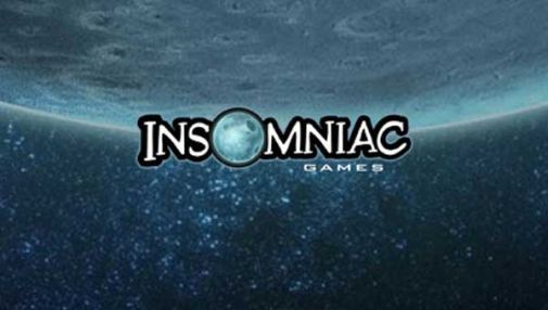
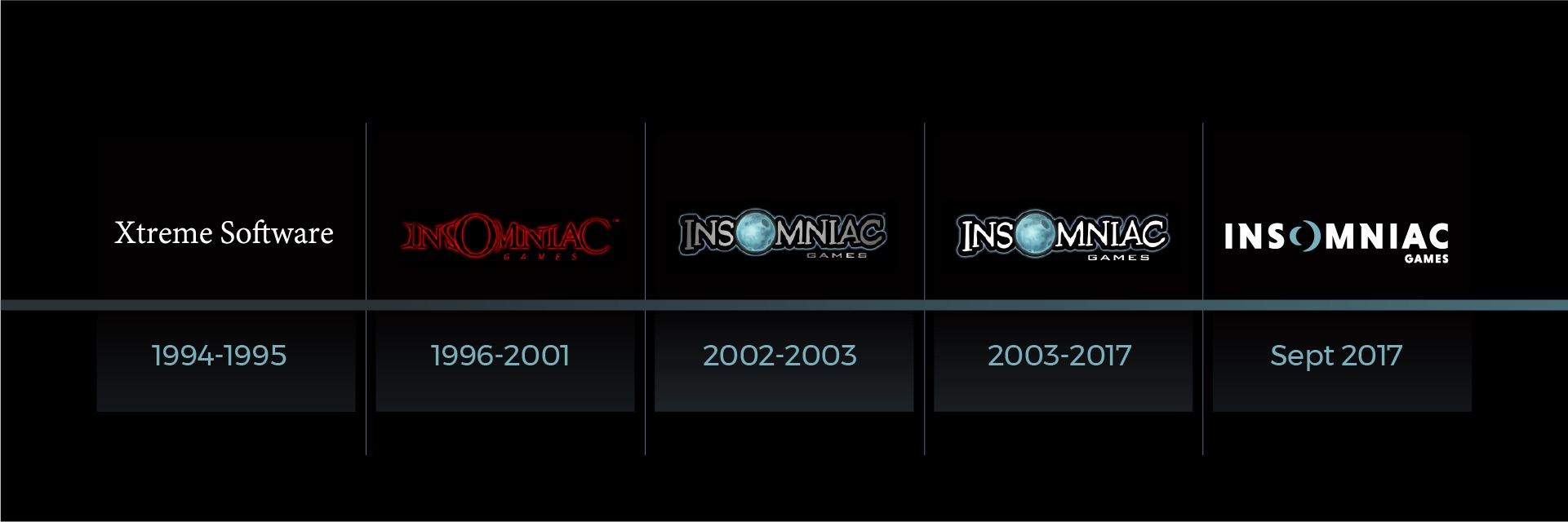
The Insomniac Games logo is almost iconic at this point- with that giant full moon substituting for the O, there are many gaming memories associated with the logo showing up at the start of beloved games, from Spyro the Dragon to Ratchet and Clank, from Resistance to Sunset Overdrive, and more.
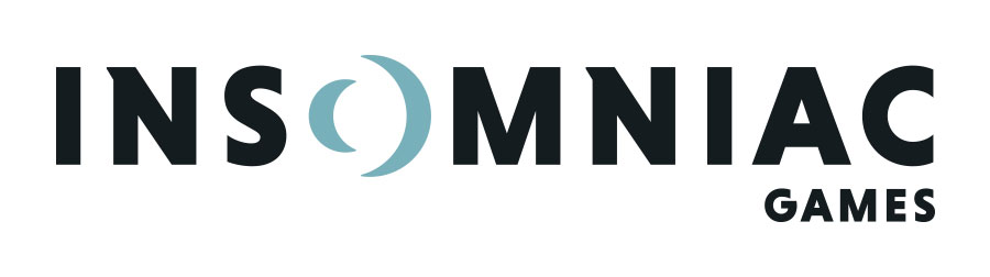
But as the studio moves ahead, it looks like it has decided that rebranding is in order– and hence, a brand new logo. The new logo moves away from the relatively skeuomorphic style of the older logo towards something flatter and more minimalistic- which seems to be in line with modern aesthetic tendencies.
The new logo definitely looks good– I don’t think there is anything about it that I can complain about (if only because there’s so little of it to begin with). That said, my heart will always belong to the logo they had before this. That is the one I most fondly associate with the company’s output.
Insomniac’s next game will be Spider-Man, and it is due out exclusively on the PS4 next year.