The PlayStation 4 UI has received its fair share of compliments and complaints since launch. While it is a very large improvement over the PS3’s interface, some still feel that it could use a few more features. One Reddit user decided to create some mock-ups of what the PS4 UI could look like with a few changes. Check them out below.
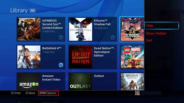
The most obvious change here is clumping together the games and apps you have in one Library and giving you the chance to hide the ones you don’t often use. You could always sort these out though, with options for displaying hidden apps and games.
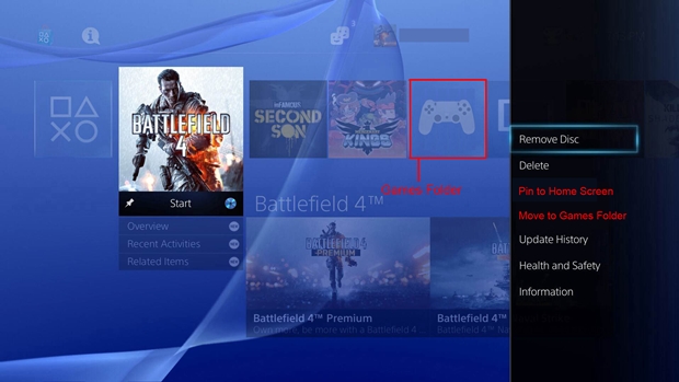
The other net addition here is for a Games folder. You can also choose to move games to this folder or pin them to your home screen for easy access. This is a good way to get everything organized.
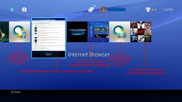
Finally, you have the Internet Browser section which consists of different Live Tile-like squares. Options for deleting apps that you don’t use would be available, along with Library tiles showing your more recent games. Other options include what you were viewing last on your browser, which PS Shows you were viewing last, etc.
What do you think of the above mock-ups and do you have any of your own changes to recommend? Let us know in the comments.