We, as avid video game enthusiasts, will often tell you that graphical fidelity isn’t important and that quality of gameplay and the experience is what counts. Well, that’s only a half truth. You see if you can make something mind blowing and fun, then you certainly should. But if you can make it mind blowing, fun and beautiful, then you should probably do that, because why limit yourself?
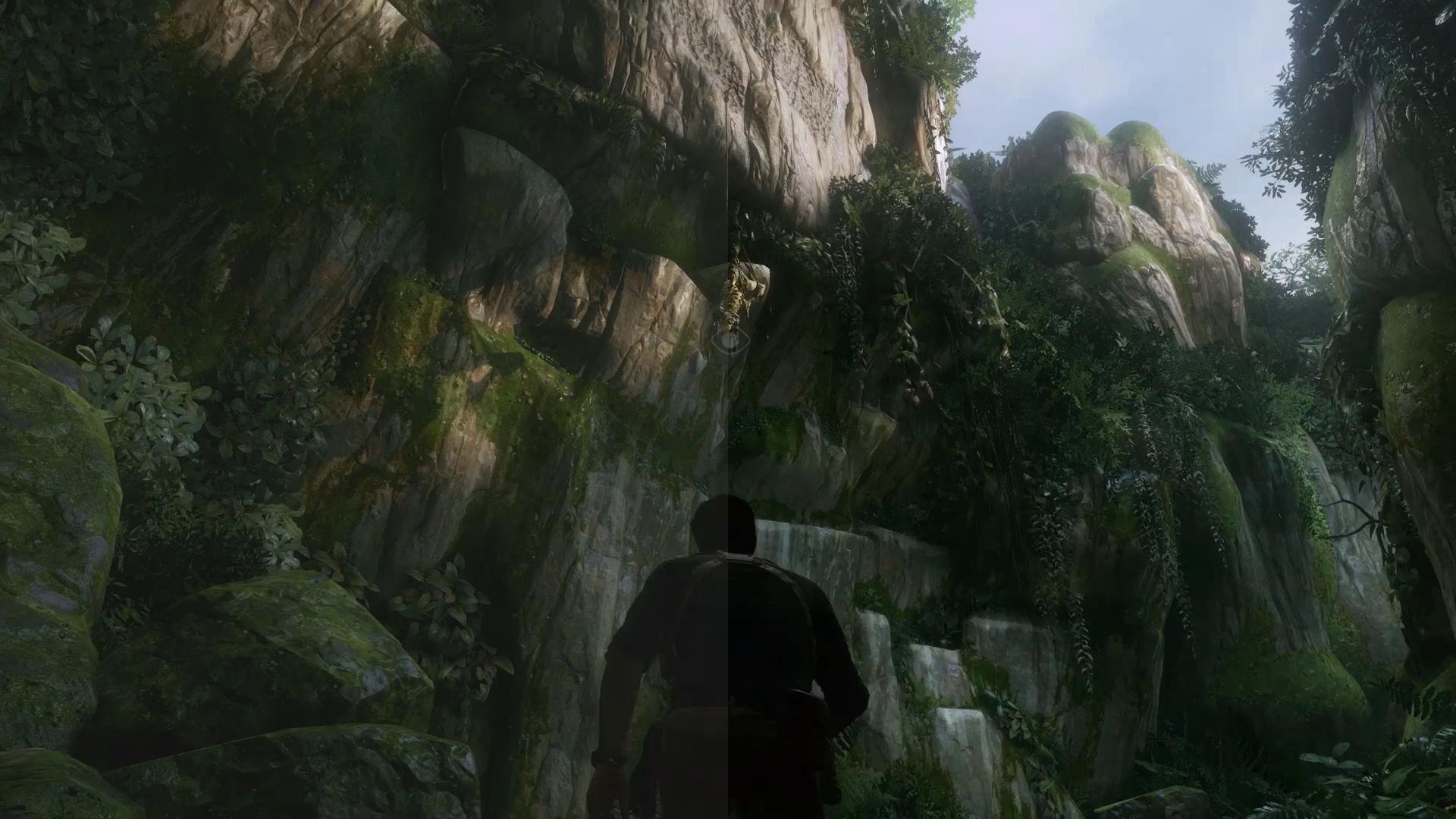
As was proven with the image of PT Silent Hills that went viral, yes this one, we do like our games to look as amazing as possible, after all we do pay enough for them. The same goes for Uncharted 4’s visual which have previously only been shown in somewhat washed out tones.
This is when NeoGaf user Skux stepped in and ran some colour correction on the footage to get a much better end result. Just looking at the images really lets you see how robbed of depth the game was by using the muted tones. With the game still being in development, lets hope this was just a video issue and won’t reflect the games final quality.
You can check out more color corrected images here.