Skyrim is an amazing game, the critics acknowledge that and even the gamers acknowledge that, but there are some niggling issues with the game, especially on consoles. But this isn’t about the technical failures of Skyrim, it’s about getting the core game mechanics right.
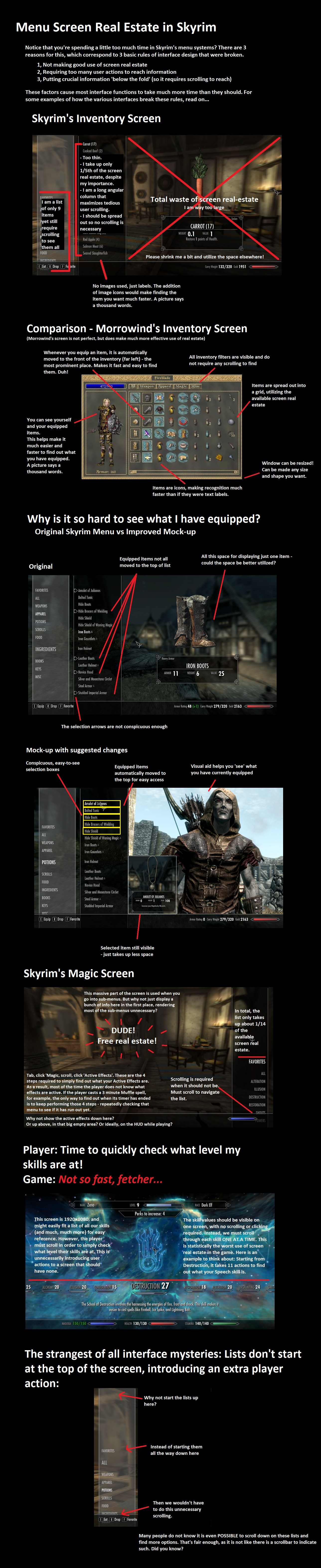
I remember getting upset with Witcher 2, which had an inventory system designed with the Xbox 360 controller in mind, and again, in Skyrim we have an inventory system that is just cumbersome to use. This is a constructive criticism, however, so Bethesda should have designed the inventory screen like… Morrowind?
Yeah, Morrowind, although, with a little tweaks, of course. Check out the image below courtesy reddit.com, it really would have made it much enjoyable to use.
Tell us what you think in the comments section below.