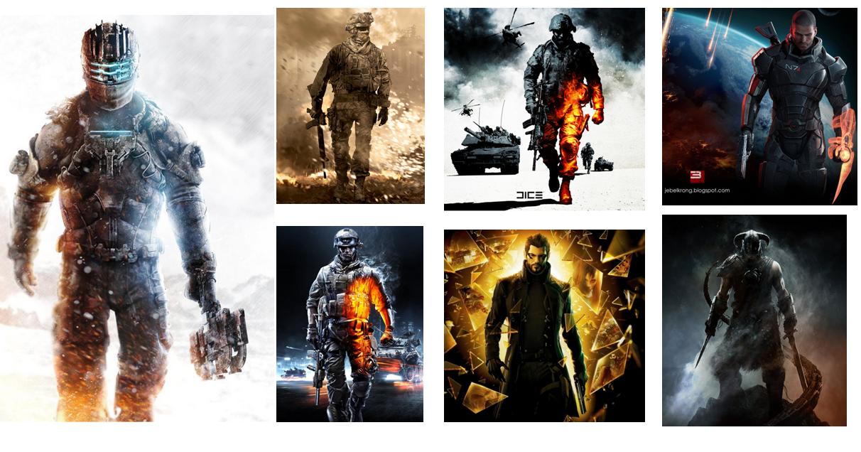
Getting the box art right has always been one of the most difficult things that a game company fails to get. For example, when you see a box art like this one, it really resonates with consumers.
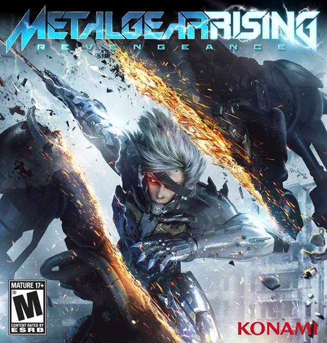
Rising’s box art features Raiden, the main protagonist of the game, but it does not look generic at all. Some of them are created after being in consultations with focus groups, like the Bioshock Infinite one, which also features the main protagonist, and there was a backlash recently due to how poor it was.
There’s a lot of box arts out there that we feel do not do justice to the games and no one will give it a second glance while walking past it in a supermarket.
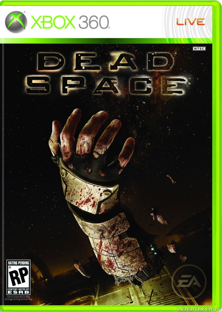
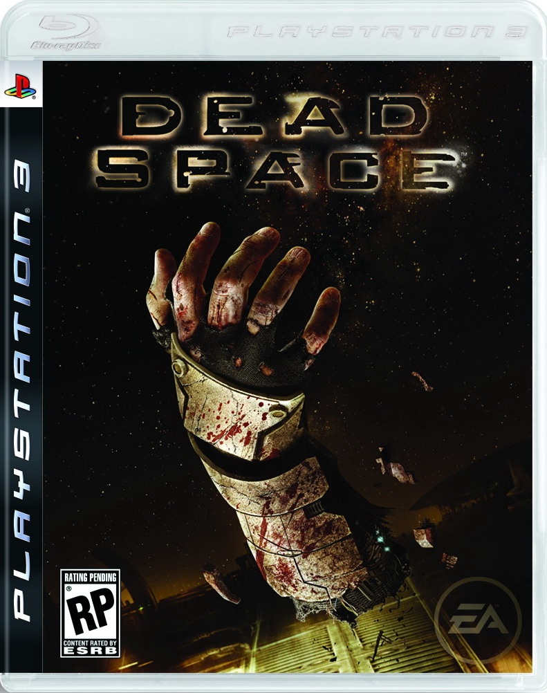
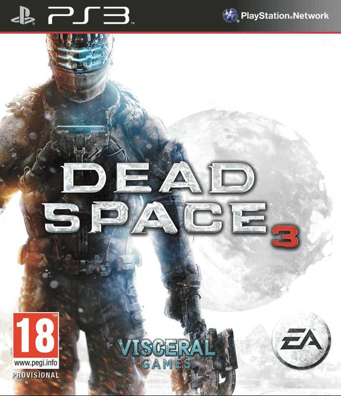
In this article, we want to specifically talk about Dead Space 3’s box art, a game from a IP that is considered to be one of the most innovative ones this gen (not kidding). When you saw the box art for the first Dead Space game, released in 2009, the theme was clear.
It was something related to dismemberment, which the game focuses on a lot.
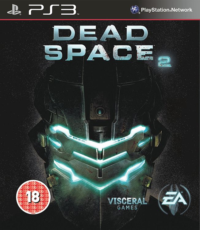
The second game featured the helmet of the suit, which again showcased how amazing the suit designs are. Dead Space 2’s suit designs are some of the best ones out there.
The third one? Well, it’s a game clearly targeted towards the mass market, and considering EA’s comments about how they want 5 million sales to keep making more Dead Space games, this isn’t a surprise at all, and a bit unfortunate too.