Over the years, the adorable and inimitable Kirby has sort of become a guinea pig for Nintendo- just as his powers and very form are malleable and change according to the requirements of the specific predicament that he finds himself in, so too has Nintendo had him appear in all sorts of experimental games, a lot of them only tenuously connected to Kirby’s original premise, banking on the familiar brand value and mascot recognition to sell a risky new idea.
One of the most successful of these off beat experiments starring Kirby was Kirby and the Canvas Curse, which was released on the Nintendo DS nearly a decade ago, and which served as the first (and to date one of the most successful) demonstrations of full touch screen gaming. it helped that, along the way, Kirby and the Canvas Curse was a hell of a game too. For Kirby’s very first outing on Nintendo’s Wii U console, the Japanese gaming giant decided to revisit that idea with Kirby and the Rainbow Curse, perhaps hoping to recreate some of that same dual screen touch screen magic for the console that they originally did for their handheld.
The results, however, were decidedly inferior this time around.
"It just seems to be a poorly conceived game."
There are multiple reasons why Kirby and the Rainbow Curse fails, in spite of coming off of a fundamentally strong base. For starters, it just seems to be a poorly conceived game- most of the time, your attention is focused entirely on your Wii U Gamepad screen, as you direct and control kirby from the touch screen, leaving you with scant chance to actually look at the TV. This, in turn, leads you to wondering why this is a console game in the first place- would this not have been far better suited to the 3DS?
But questions about the suitability of the platform soon give way to frustration with the game’s monotony and shallowness. Nothing about Kirby and the Rainbow Curse ever feels broken – it is still a Nintendo game, after all, so it is very well polished and made, and the mechanics, for whatever they are worth, function well – but it all feels tiring and exhausting, in spite of the fact that it requires such little effort. The game can get mind numbingly banal, and after a while, it can feel like you are just automatically going through the motions.
A lot of this has to do with the gameplay itself- note, Kirby and the Canvas Curse was a full fledged touch screen game, and it came as a sort of revelation at the time. It was also a handheld game, and geared towards short bursts of play. Its mechanics lent themselves to being received favorably in that light. On a console, however, it all begins to fall apart. The mechanics are shallow, the level design is linear, the game has an almost criminal lack of challenge, and nothing in the package really holds up.
"The mechanics are shallow, the level design is linear, the game has an almost criminal lack of challenge, and nothing in the package really holds up. "
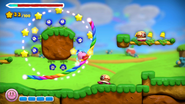
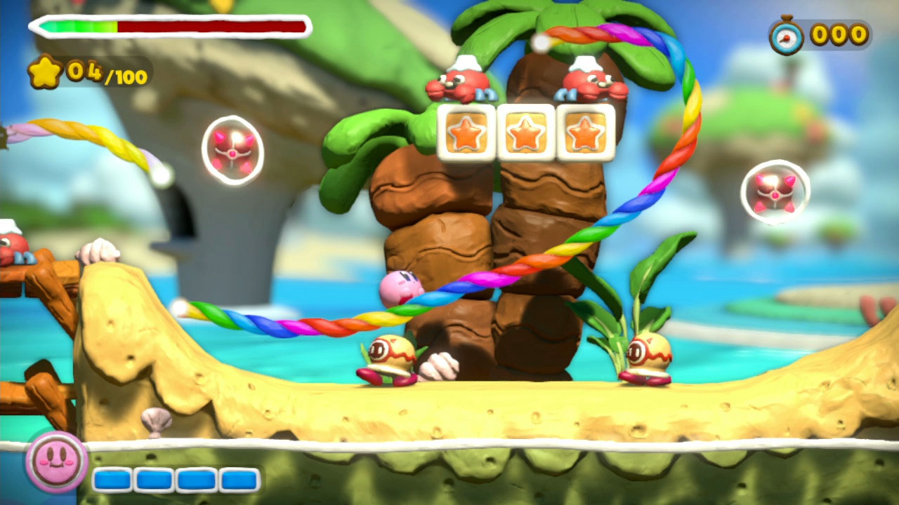
Consider, for example, how the game is played. You will be staring at the screen at all times, and helping Kirby, who is a helpless, rolling ball, navigate the levels you are presented with by drawing rainbow hued paths for him with the stylus. You tap Kirby to send him charging, and you can have him change directions by having him run into (drawn) walls. It’s a pretty good mechanic, but it needs fundamentally good level design for it to ever evolve beyond ‘gimmick’ status, and that is simply something that Rainbow Curse is unable to provide.
Levels are linear, with little to nothing in terms of secrets or hidden paths respectively, and generally, the path needed to get from point A to B becomes apparent almost immediately, meaning that the game requires almost no mental effort on your part. Given how the gameplay works, there is a complete absence of physical challenge as well.
It does not help that the game itself has almost no difficulty scaling- barring maybe the almost insultingly easy first world, the game maintains a steady clip of challenge (or the complete lack thereof), meaning again, the game is minimizing the extent of your involvement or indeed, your agency.
To add insult to injury, it’s not even a very long game- with seven worlds, each world only presenting players with three levels that can be completed pretty quickly, you have to stop and wonder just exactly what Nintendo was thinking when they made it a retail release. Yes, it wasn’t a full priced game- it’s budget priced at $40. But even that seems to be too high, and this is a game that I could have seen being best suited either as an eShop game, or maybe the headlining game for Nintendo’s upcoming mobile ventures. As it stands right now, $40 feels like a waste of money on this game.
"I can see the title being a worthwhile addition to the Wii U libraries of families with young children."
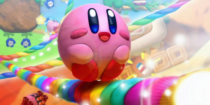
All of this said, the game is not entirely irredeemable. Over the last month or so, I have come to appreciate multiple aspects of its design. The most immediately obvious of these are of course the game’s gorgeous graphics. The game utilizes a beautiful, clay inspired visual motif and is a treat for the eyes. The wonderful graphics are, in fact, what make it even more insulting that, owing to how the game is designed, you are demanded to ignore the TV at all times, and instead play the game on the Gamepad. The Gamepad screen is fine and all, but to see the game’s beautiful graphics being wasted on its crummy 480p screen stings.
Another thing that I have appreciated is the game’s appeal to very young kids. Owing to just how easy it is, and how intuitive its touch based mechanics are to pick up on, I have found young kids taking to the game like bees to honey, or flies to sugar. Younger kids, accustomed as they are to lower quality mobile fare, either do not notice, or do not care, that the mechanics are shallow, or that the levels are poorly designed, or that the game is easy- they seem to love what they are playing. Throw in the game’s rudimentary co-op mode as well, and I can see the title being a worthwhile addition to the Wii U libraries of families with young children.
On the whole, then, that is what Kirby and the Rainbow Curse feels like- it feels like a game made for mobile devices supplanted on to a home console, and then sold at a console game price. That does feel insulting, as does the game itself at multiple times, but I have to stop and wonder if seasoned game players were meant to be the audience for this title to begin with- seeing younger children play it and take to it has convinced me that Nintendo meant for the game to be for today’s kids, who are growing up in a smartphone and tablet world, with shallow, touch screen based games. If that is what they were trying to do, they succeeded, and Kirby and the Rainbow Curse is, at the very least, better than most smartphone games. However, as an entry into the Kirby franchise, or even the otherwise shockingly high quality Wii U library, Rainbow Curse exists as a definite low point. As a sequel to Canvas Curse, it feels almost criminally squandering.
This game was reviewed on Wii U.
Beautiful and gorgeous, easy to pick up; perfect for younger kids
Linear levels, lack of any challenge or difficulty, shallow mechanics, short, and overall just mind numbingly easy and unappealing for any gamer with any experience with platformers


