As the games industry matures over the years, one thing that plagues it is how narrow the themes expressed in games often are. Whilst we have plenty of war, conflict and death, we seldom have bereavement, mistreatment and politics. Papo and Yo could have been a go to game for artistic explorations of child abuse, but stale gameplay and questionable balance leave it as little more than a reminder that brilliant ideas can’t work as a videogame if the “game” bit isn’t there.
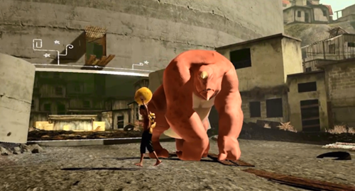
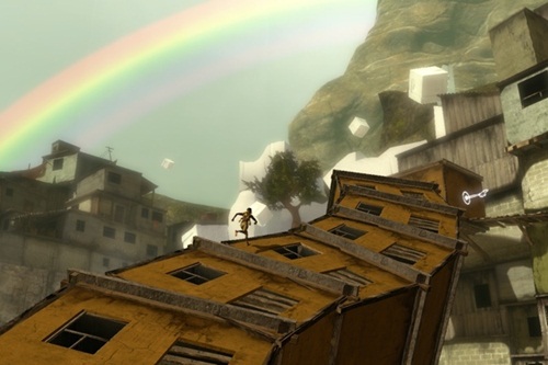
Papo and Yo casts you as Quico, a Brazillian boy who, because of the abuse he receives from his father, retreats into a fantasy world. Whilst the idea of a fantasy realm normally consists of noble knights and mystical beasts, Quico’s fantasy is a South American Favela. It’s an interesting choice from a design point of view, but one that is deftly handled by start up developer Minority. The aesthetic captures a strange sense of vivacity and colour, whilst still presenting a grimy interpretation of slum life. It is a very effective representation of how we see a poverty stricken area of South America, but through the eyes of a young boy.
The world of Quico’s mind also feeds into the gameplay dynamics for, whilst a 3D platformer at heart, the game contains a great deal of puzzles that involve Quico manipulating his dream world. Buildings stack and tilt to your whim, floors peel up to grant access and platforms gain legs at opportune moments. It’s a genius visual trick that always excites, but the gameplay element is lacking. There’s nothing wrong with the game as such, but there’s just something unsatisfying about the whole affair. Platforming sections are never a challenge, the general difficulty is a breeze and puzzles seldom require anything more than pulling switches in a particular order. It all works fine, but there is a lack of soul that drags the experience down. The real issue is how easy it all is. That said, one moment in particular had me stumped for about an hour on account of a minor gameplay element I totally forgot about. The joke was that this was the only point in the entire game where no hints were offered. The rest of the game is littered with hint boxes that Quico can place on his head for clues. Whilst I spent the majority of the game laughing at the idea of hints being needed in such an easy game, they failed to be provided at the one moment they could have been helpful. A greater diversity of play testers could have ironed out these difficulty spikes, and this would have rounded off the biggest complaint I have with Papo and Yo.

Monster’s gameplay elements keep things from getting too dull, but the gameplay is still just a glorified hunt for switches and levers.
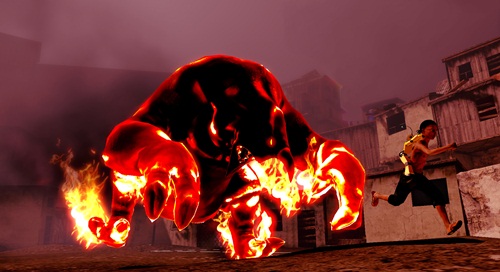
One of the more interesting mechanics in the game is that of Monster, a partner creature who Quico must use to clear certain puzzles. Monster initially appears to be a figure of fear, but is docile enough to be approachable once you actually meet him. Though players can’t control him directly, you can guide Monster around with various coconuts that litter the level. This could have been exploited better, as puzzles involving Monster only revolve around getting him to stand on switches and bouncing on his belly to higher platforms. Still, it at least somewhat alleviates the repetition found elsewhere. The real genius of the character of Monster comes through the introduction of frogs. Whilst harmless on their own, Monster will chase down frogs upon sight and, should he get his hands on one, he flies into a rage and will wind up attacking Quico mercilessly. It’s a very naked and obvious metaphor for the mistreatment Quico receives, but it fits the world and gameplay well. This mechanic is overused to the point of becoming tedious late game, but the first few times are engrossing, serving to make the player share the weakness that Quico feels when against the anger of his father/Monster.
The narrative takes this theme and runs with it to the very end, making for a tale that, whilst rather short, has some endearing moments. It is certainly well crafted, and it does a great job at tearing at the heart strings, but the technical faults of the game often shatter the immersion that it works so hard to build. For a start, whilst the visual design is creative, the technical elements of the graphics engine don’t come up so strong. Textures are often bland, animations are wooden and lips fail to synch at the most inconvenient of times. It’s all very uncanny, and removes the human element that the story works so hard to craft. On the other end of the scale we have the music, an element that is always delightful. The beautiful acoustic music takes many cues from South American timbres, creating a vibrant soundtrack that fits Quico’s imaginary world perfectly. What a shame then that the graphics couldn’t quite match this level of excellence.
By the end of the story I felt a deep connection with the message of the game. Papo and Yo handles its subject matter with an aloof, yet effective, sense of abstraction, but it’s a shame then that you have to endure such boring gameplay to get there. Videogames offer an interactive element that makes them, at their best, one of the most affecting mediums available. Despite this, aside from subverting the control the player has during Monster’s fits, Papo and Yo would be far better in another medium. I had to enjoy it in spite of its “game” elements, rather than because of them; and this should never be the case. If you are more interested in art than raw gameplay, or find the themes and game world of primary interest, then Papo and Yo is short enough to give you an emotional rollercoaster with minimal frustration. If you’re looking for the next puzzle platforming fix, however, then stay away. This is not a gamer’s game by any means, a true shame if ever there was one.
This game was reviewed on the PlayStation 3.
Engaging narrative, Brilliant concept, Beautiful game world, Excellent soundtrack
Odd difficulty curve, Boring puzzles, Quite short, Little replay value, Lifeless platforming, Occasional technical faults


