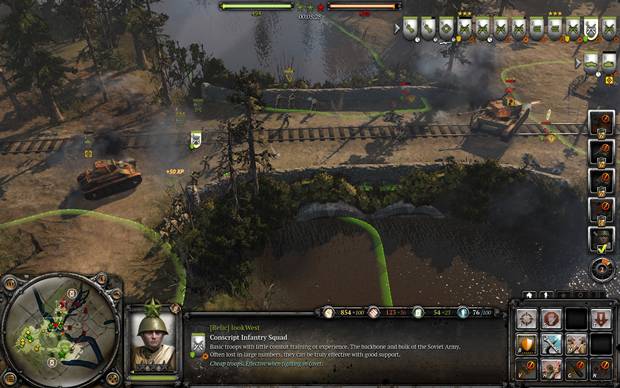
The official website of Company of Heroes 2 has detailed the in-game user interface of the game, explaining several sections. You can read all of that and see the screens below.
The minimap is similar in design to the one we saw in the original. The map displays capture points and territory control lines. Unit Portrait lies to the right of the minimap. This section provides a high fidelity representation of the selected unit. Top top that, it also displays combat information including health, experience progress, experience rank, allegiance, kill-count, temperature, active abilities and vehicle criticals.
The UI also includes the Bridge. It gives the player a reference for how to be effective on the battlefield. Selecting multiple units displays a list of unit decorators on a single line, allowing for fast unit sub-selection, upgrades and reinforcement. Along the top of the bridge is the Resource Panel. This helps the player to compare the costs of purchasing new units and their available money.
Unit decorators are iconic representations which display important parameters like health. The Global Unit Control shows Infantry in the top row followed by the vehicles below. This helps the player understand about which units are under attack. Commander Ability Menu shows several abilities like air strikes and artillery.
Check out this developer diary from Company of Heroes 2.
The Command Card returns in Company of Heroes 2 and it is just the way it was in the original. The game is due this year for the PC. Stay tuned to GamingBolt.com for more news and updates.


