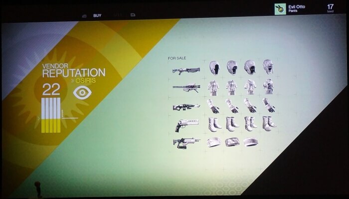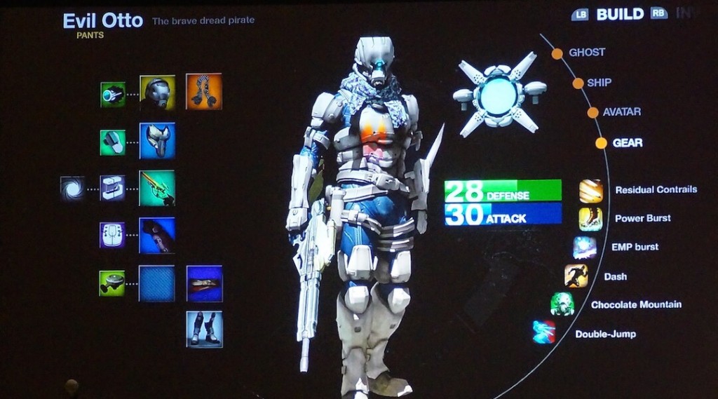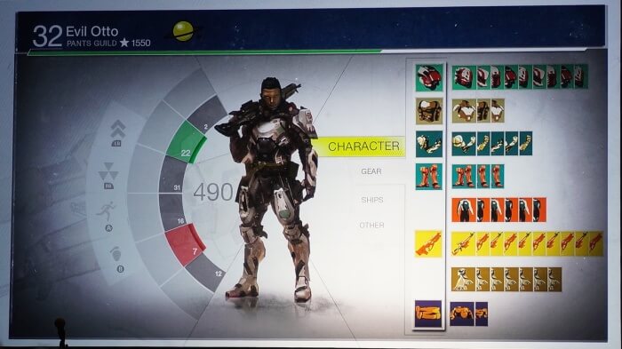
Destiny gets a lot of things wrong, but the UI is definitely not one of them- so much about the game’s UI is a joy. It is clean, immediately communicates all relevant information to the player without overloading them with unnecessary icons and text, and actually navigating it feels great.
This is because a lot of work went into the UI. Speaking in a talk given at GDC this week, Bungie’s lead UI designer, David Candland, went in depth into the sheer amount of work and effort that went into getting the Destiny UI just right. The UI was in development for a lot of time, and a lot of it had to be retooled thanks to Destiny’s constant development problems.
Once they settled on the current design for the UI, there was still a lot of work to be done- defying common console game design wisdom, Bungie decided to have a free flowing cursor, not unlike a mouse on PC, with Destiny. Even there, lots of special touches were worked on to have the UI be effective. Subtle touches like selected icons enlarging slightly as the cursor hovers over them, or having the cursor move over icons and menu options more slowly (for which Bungie appropriated their Aim Assist technology) were all worked into the UI.
All of which led to the new UI being loads better than the older one, which honestly looks horrific. You can check out some old UI designs below.
[Thanks Kotaku]

