S.T.A.L.K.E.R. is a first person shooter series that started in 2007 and was released on Windows PC that was generally received well enough, but also divided first-person shooter fans to a notable degree due to its handful of technical issues and visual glitches here and there. The game ultimately ended up aging relatively well when compared to many of its contemporaries because of its more unique setting and interesting concepts like its bleak setting and its blend of horrifying monsters and spooky locations with relatively traditional first person shooter gameplay mechanics. The game reviewed well with most mainstream critics and was even awarded for its atmosphere by GameSpot, but still ultimately was held back from unmitigated greatness as a result of its buggy nature. It may, then, come as little surprise to many that the game never quite turned into a major franchise with it being well over ten years since we’ve heard anything official from the franchise.
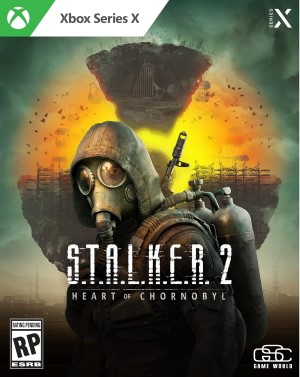
Most of the time when IPs like this go for more than a handful of years without a new sequel getting announced we get don’t get another one, but with this IP it appears we will have an exception on our hands as S.T.A.L.K.E.R. 2: Heart of Chernobyl was recently announced to be coming from the same studio to Windows and Xbox in April of 2022. From the vertical slice trailer that we saw for the game’s announcement, there appears to be a lot in the game that is praiseworthy. From what sounds like pretty good voice acting, an interesting story that expands on the ideas of the original game, to the audio design we have plenty to be excited for with this upcoming game. However it’s really the graphics that were the standout characteristic here. S.T.A.L.K.E.R. 2: Heart of Chernobyl is arguably the best-looking game announced for E3 this year as it currently stands, and if you watch the trailer a couple of times you’ll see a lot of reasons to think that.
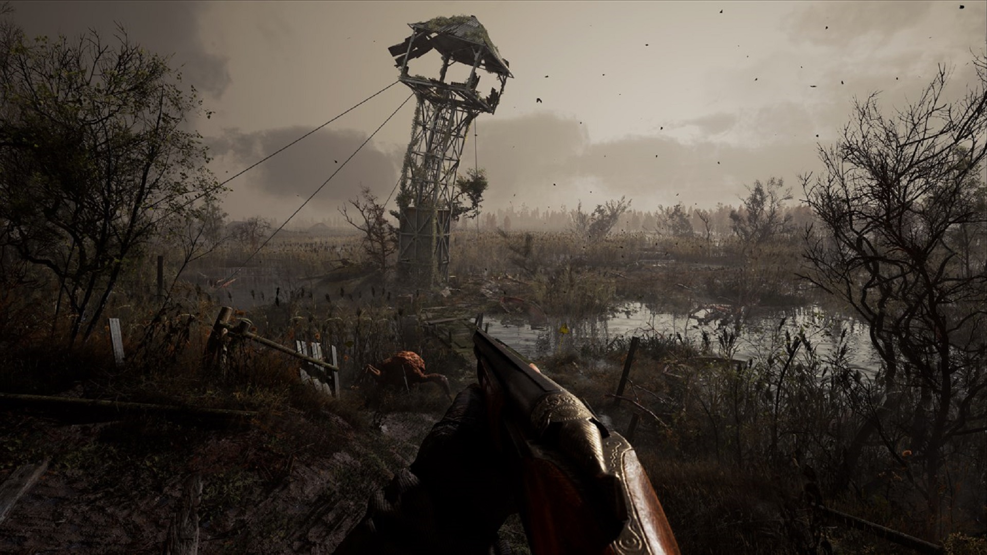
First the environmental stuff. From what we see in the trailer, there appears to be a lot of emphasis placed on the time period and just general state of affairs in the world for the game. Most of the vegetation “in the Zone” looks appropriately fried, most of the technology shown seems either constricted by its time period or fancifully evolved from it with a 1980’s technology gone awry aesthetic, and it all looks good together, adding up to a convincingly appropriate look and tone for a game based on the area and time period of the Chernobyl disaster. With that setting would obviously come a lot of dilapidated buildings, crumbling infrastructure, and of course a desolate landscape that nobody of sound mind would ever want to hang around in unless they had to.
The outside environments vary greatly from the interior ones as well. In the trailer we see inside a couple different types of buildings, with older decaying structures that have entire sections of walls missing and broken floorboards that give way when characters step on them. Whether those animations are canned and structured or dynamic and actually reacting to weight being pressed upon them in real-time is ultimately immaterial to the effect they provide. Subtle things like that go a long way to establishing the unkempt nature of the structures that you’ll be visiting in this game. These are buildings that have obviously been through some catastrophic events and haven’t been maintained well since then. As a result, they feel adequately battered and decrepit. One internal structure during the trailer takes on more of the game’s science fiction aesthetics with toxic green light spilling out and over the rusty browns and reds of the rest of the room and looks really interesting as a result. So aside from the graphical prowess and realism of the presentation, it’s also looking like the game is going out of its way to have a nice variety of locations that all look distinct but still appropriate for the story and setting, which is exactly what you want in a game like this.
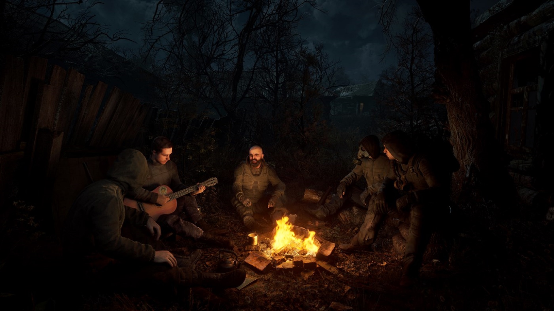
Inside all of those environments of course are the little things that anybody who likes a good looking game will appreciate. Shadows are dynamic and subtle. Heat from the campfire warps the environment behind it in real-time, and the character models themselves are quite a step up from most current gen models you are likely to see with plenty of detail and independent objects on their outfits moving in real-time.
There are several moments where the other non-playable characters are conversing with the main protagonist and all of them look great. Mouth movements are smooth and seem to have lots of points of animation while also matching up with the dialogue in ways that seem more genuine than a lot of the mouth movements that we’ve gotten accustomed to from most games that often look robotic outside of cutscenes.
It might seem like a small thing, and perhaps it is, but having believable real-time animations with NPC’s can absolutely go a long way to helping you feel more invested in that character and what they are doing, which of course creates a more immersive experience overall. Even more striking is the gunplay, showcasing some extremely good looking weapons, the more interesting of which with intricate moving parts and subtle particle effects spraying out of the muzzle as it’s fires, as well as some eye-catching animations of things being blown apart by grenades and fragments of boxes flying towards you.
This really seems to emphasize just how visually messy an actual firefight can be with things breaking apart and explosions impacting more than just their immediate area of effect. One can only imagine what these systems might be able to visually pull off in some of the game’s later sections when combat gets more complex and involves more enemies at once. The enemies themselves aren’t seen much, but the recognizable squid-mouthed monster design from the original game does seem to make an appearance here which is nice to see, as a close up shot of the monster is shown that really takes that grotesque design to a whole new level. Blowing these things away as well as some of the other creatures that are surely in store for us in this game should be a feast for the eyes for anyone looking to enjoy a good roster of horrible monsters and disfigured humanoid designs.
Surely we still have a lot to learn about the newest game in the S.T.A.L.K.E.R. franchise as there do seem to be some other gameplay mechanics at work here. This franchise might have been on ice for a while but it does appear to be heating back up with this newest entry. Interacting with this world’s cast of incredulous, eccentric characters and battling with its horrifying abominations should, if nothing else, be a visual showcase for current gen consoles. Hopefully we’ll get to learn more about it soon, because if these graphics are any indication then the game surely has more than a few more tricks up its sleeve.
Note: The views expressed in this article are those of the author and do not necessarily represent the views of, and should not be attributed to, GamingBolt as an organization.


