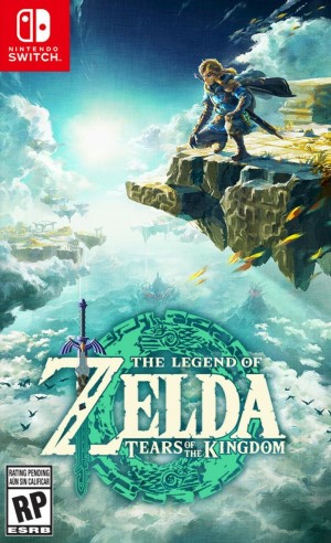
Nintendo has done a fantastic job with The Legend of Zelda: Breath of the Wild, a game that has proven instrumental in laying the blueprint for some of the best open worlds of recent memory. The game’s set of mechanics was ripe to be built upon with a sequel, and Tears of The Kingdom is here to do just that. The game not only delivers a huge leap in terms of the systemic gameplay that defined the original, but also makes pretty substantial changes in the graphics department as well. With this feature, we will be diving into the technical aspects of The Legend of Zelda: Tears of the Kingdom, and take a look at each aspect of the presentation in a detailed fashion.
Game Engine And Overview
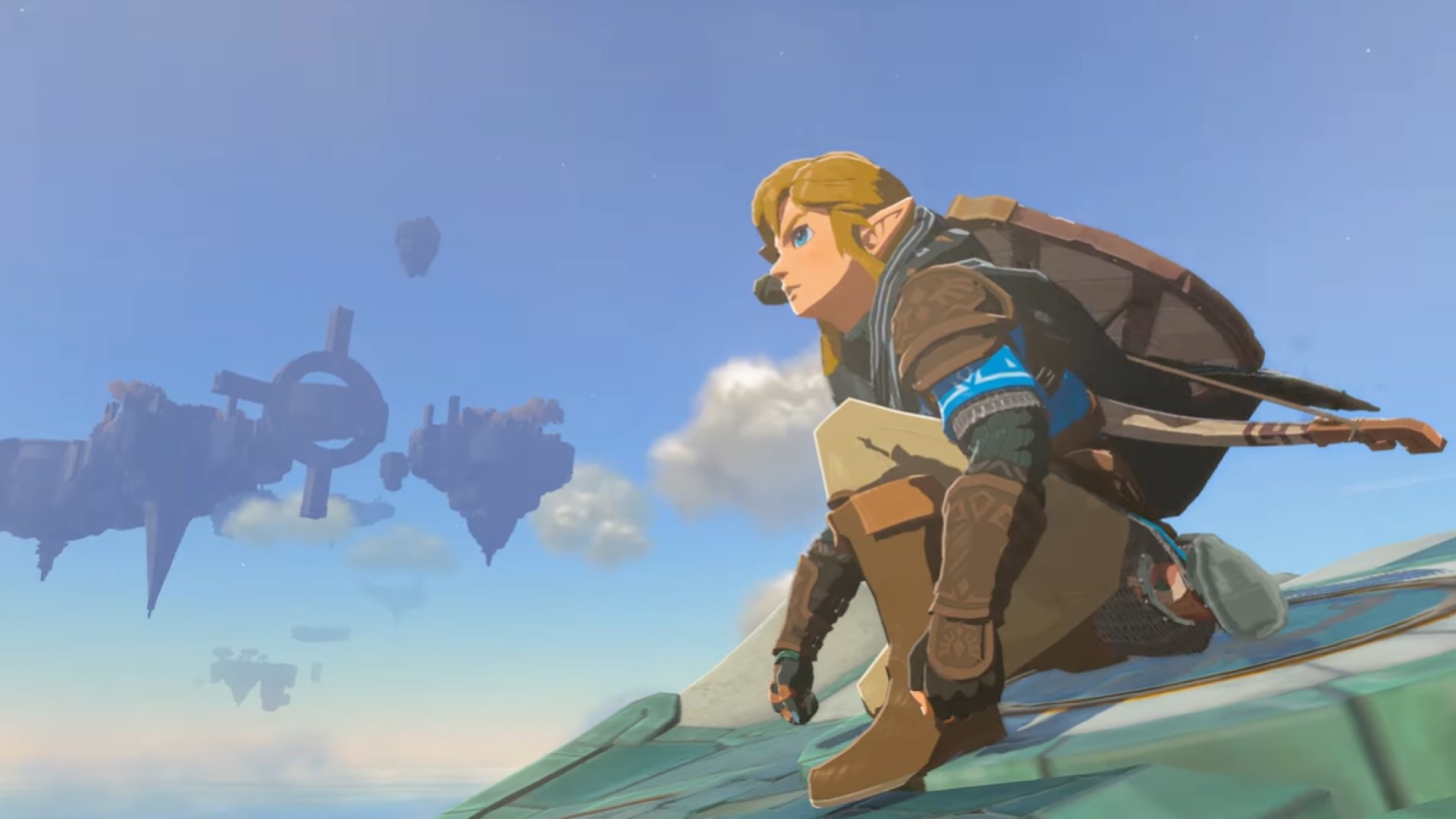
The Legend of Zelda: Breath of the Wild operated on proprietary tech that also combined a highly specialized version of the Havok physics engine to power its systemic gameplay. The same engine seems to have been upgraded for the sequel, and that makes complete sense since the two games share the same art style and many other gameplay elements.
Tears of the Kingdom makes significant strides in the lighting department, and we also get to see better light and particle effects in the gameplay as well. It definitely puts the 6-year-old Nintendo Switch to its paces, and sometimes it can break under the pressure with world streaming and pop in issues that we will be discussing in detail in further sections.
Character Models
The Legend of Zelda: Tears of the Kingdom seems to share the same character models as Breath of the Wild. We didn’t notice a lot of change in terms of fidelity levels, though that has a lot to do with the cell shaded art style of the game. But all in all, Link still looks good in a visual sense – complete with hair physics and physically based materials for the clothes that you don.
The same story continues over for other character models as well, though new enemy types like the Golems have a great deal of complex geometry which makes them stand out against returning enemy types which have also gone through minor redesigns for the sequel. Character animations are highly expressive like the original, and they look equally good here as well.
The Environment
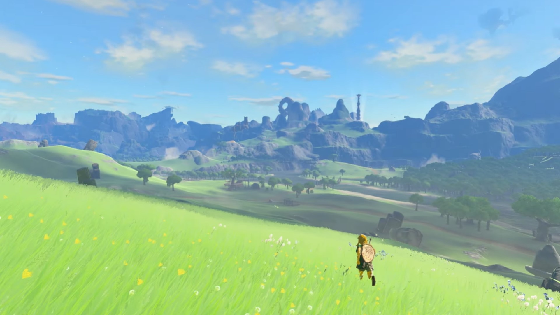
Tears of the Kingdom takes place in a highly altered version of the same kingdom of Hyrule that we saw in the original. This means that while you might be visiting the same locations as before, they have been changed in significant ways that makes exploring these spaces a consistently enjoyable experience. Apart from that, you can also take up to the skies and explore the many floating islands that pepper the skyline.
As such, the sky is an important part of the presentation in Tears of the Kingdom – and rendering in this aspect has seen substantial improvements than before. Clouds are built using volumetric particles, and while they aren’t all that dense – they certainly look good in the grand scheme of things. Clouds are obviously drawn at distances far from the camera, and clouds that are at a great distance from the player seem to get replaced by a static fallback texture to save up on performance.
Apart from that, the asset quality has seen an uptick in certain areas including but not limited to the terrain which looks a lot more detailed than before. Foliage also looks marginally better than before, but it still doesn’t react to the player’s movement and Link will awkwardly clip through that geometry like Breath of the Wild. Material quality for elements like rocks and stone buildings looks to be roughly the same as the original, though again that has a lot to do with the art style of the game.
Briefly touching on the world streaming, Tears of the Kingdom features a much bigger open world than before. Breath of the Wild was already pushing the Switch to its limits, and Tears of the Kingdom pushes it even further – and it starts to show some visible signs of crack. The draw distance is certainly high, but that’s compensated with very aggressive level of detail swapping that can cause texture pop in. This is most visible when you’re zooming past the map at great speeds or gliding from the sky.
Most of these issues wouldn’t stick out too much while playing in handheld mode, but it does make a difference when you blast that image on to a big screen. Again, it’s really surprising that Nintendo is able to squeeze out this much of performance from the hardware – but those flaws should be pointed out nevertheless.
Lighting, Reflections, And Shadows
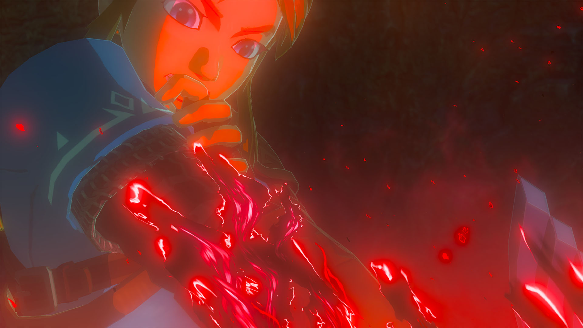
Coming over to the lighting department, Tears of the Kingdom seems to utilize the same global illumination implementation as Breath of the Wild. There are some marginal improvements that make the sequel look better, including but not limited to better weather effects and brighter lights which also lend a better dynamic range to the environments this time around. Indirect lighting is still pretty rudimentary, which is to be expected considering the power of the target hardware.
Water bodies accurately reflect their surroundings, and because the reflections change perspectives accordingly – the implementation seems to be of the screen space kind rather than a primitive cube map one. Of course, the resolution on the reflections is pretty low but it doesn’t really stick out that much due to the highly stylized visuals.
Shadows have also seen some changes, such as dynamic light sources like torches now being able to cast proper shadows across environments – which is most visible in dimly lit caves or shrines. We also get to see both hard and soft shadows being casted by sources throughout the environment, which lends a sense of richness to the overall image. Shadow maps, on the whole, are much crisper than before but if you peep in close, you will be able to make out some artifacts along the edges.
Post Processing
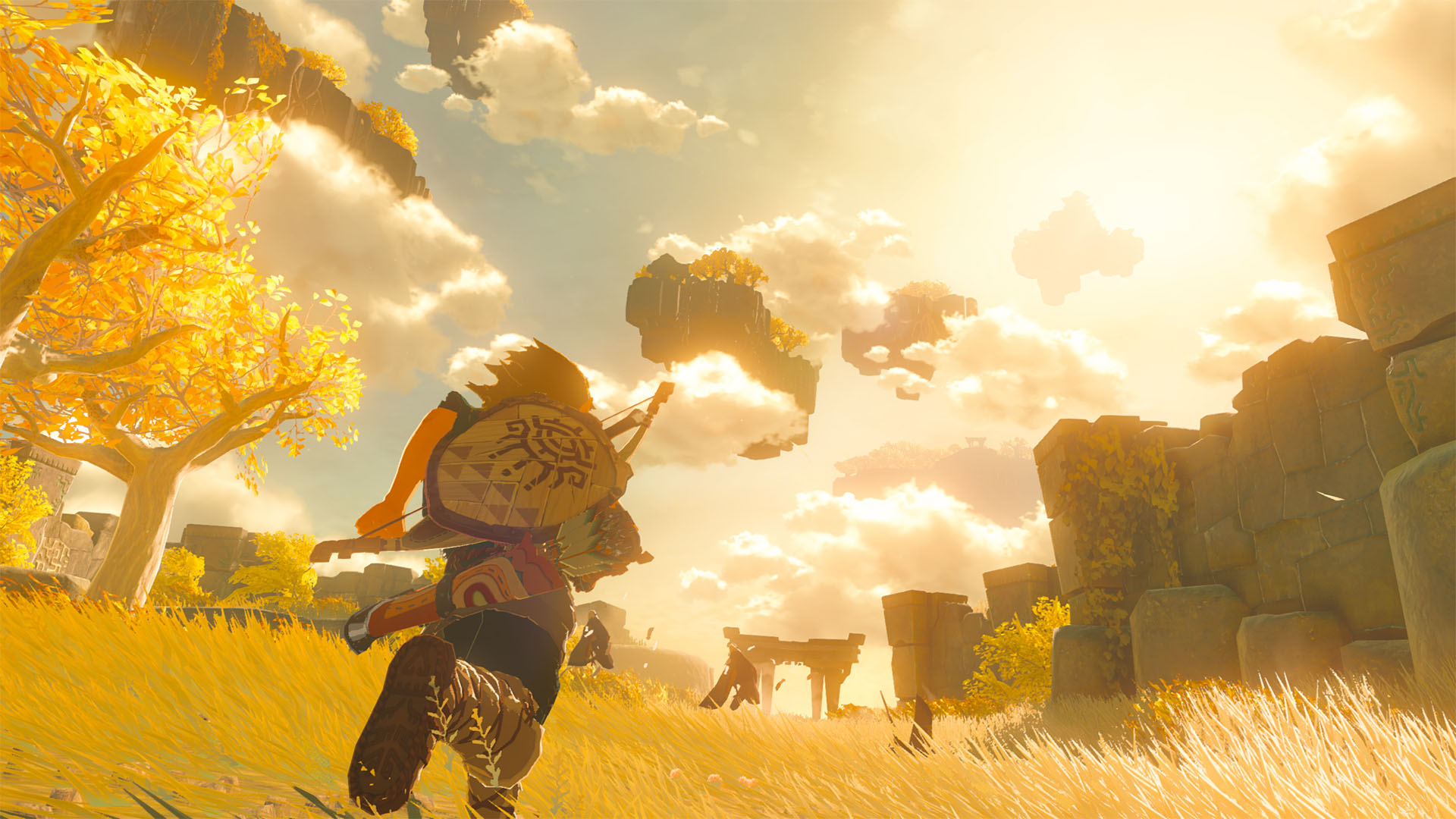
Switching gears over to the post processing, Tears of the Kingdom features a bevy of particle effects that add a lot of flair to the image. Light streaks not only light the environment in a more accurate fashion, but they also cast proper shadows this time around. Alpha particles are also emissive in nature, and they look a lot better than before.
We also get to see volumetric fog used to depict a sense of scale within the open world environment, and it also doubles as a way to mask the lack of detail for distant objects. Depth of field effects make a return as well, and it seems to be mostly identical to the original. Finally, we also get a better dynamic upscaling implementation this time around which results in a much crisper image than Breath of the Wild.
Performance and Resolution
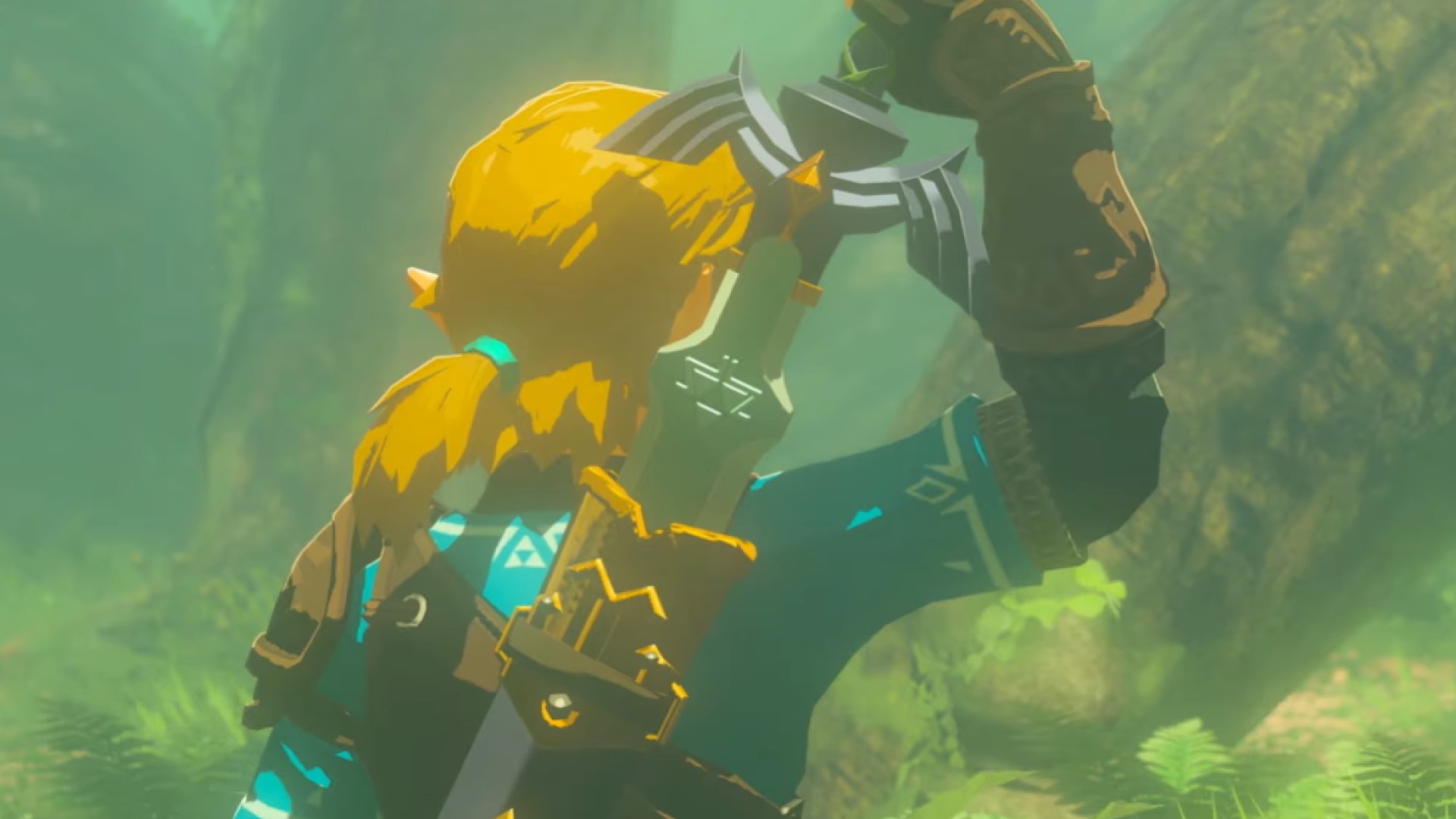
Breath of the Wild ran at a dynamic resolution in both docked and undocked modes, with the former running at a dynamic 720p and the latter at a dynamic 900p. This helped the game in maintaining its 30fps resolution. The same set of parameters get carried over to Tears of the Kingdom as well. Performance for the most part is stable but there are frame rate drops here and there.
Conclusion
In conclusion, Tears of the Kingdom is all that one could ask from a sequel to one of the most influential open worlds of recent memory. Even on a purely technical level, Tears of the Kingdom impresses with its lighting and post processing options. Nintendo seems to have taken more of an iterative approach to the visual upgrades, but it works well within the context of the game itself.
Breath of the Wild was already pushing the console to its limits, and Tears of the Kingdom is able to ooze out more power from the same system to render a much bigger world complete with multiple levels of elevation. Of course, texture pop-ins and slowdowns are still a problem, but it’s really fascinating to see a 6-year-old console running such a massive AAA game without any significant hiccups.


