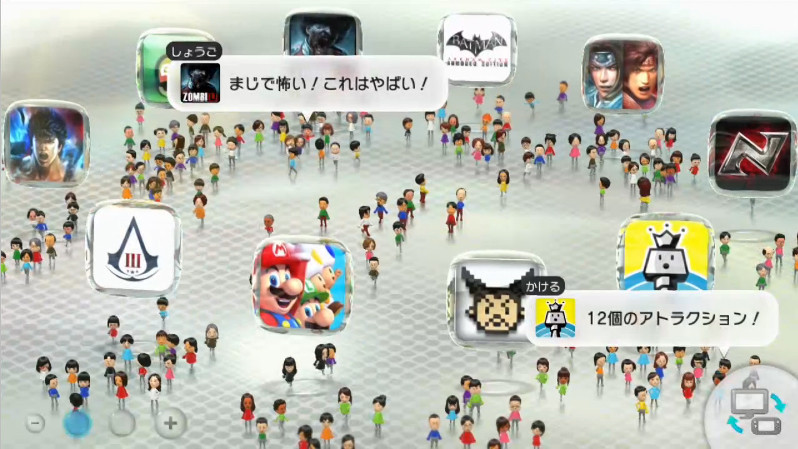
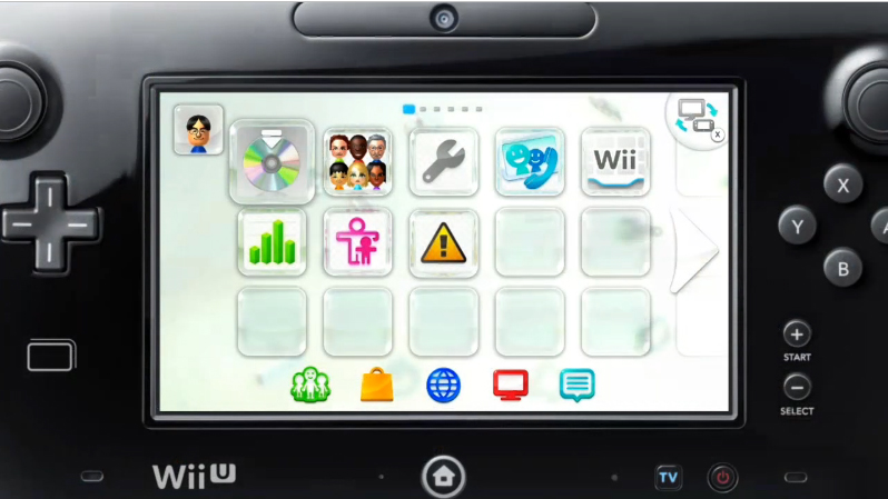
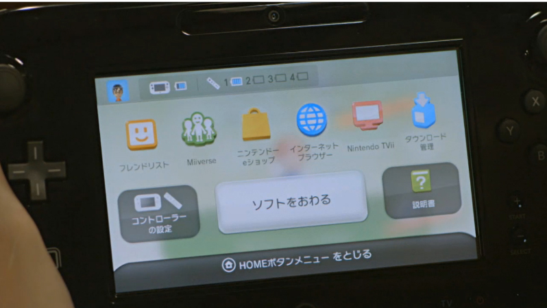
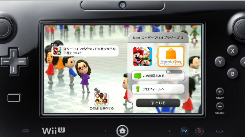
Giantbomb have got their hands on a bunch of images (Via Neogaf), which show the Wii U menu in all its glory, and yes, on the gamepad. It resembles the 3DS one quite a lot and in a way considering both are fairly new, it makes sense.
You can see the MiiVerse and other things, and if you own a 3DS, this should be simple to navigate for a user. The Wii U gamepad is not capacitive so multitouch is out of the question, however, based on most previews so far the touchscreen is very responsive according to people who’ve used the system.
It contains a bunch of small tiles, which should be customizable as you want. Everything looks clear and crisp and that’s a good thing. We are waiting for more details on the online and how user profile works, it should be clear how the system’s software is after we get that.
The Wii U comes out on November 18 in the US, and November 30 in the EU.


