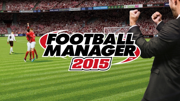
Football Manager 2015
This isn’t a bad cover in theory, but the execution is just plain lacking. The framing is wrong, the picture seems to be off centered, meaning there is no central subject that draws our eyes, causing distraction, and just a lot of cross vision. I mean, I get that they wanted the logo to be centerstage, but I don’t know, the image in the background just isn’t gelling with it.
Awesome game, though.


