User interfaces might not be the most important thing in video games, but they’re sure as hell important. I mean, a bad or a good user interface cannot make or break a game, but it sure can affect its quality. That especially holds true for handheld games, because with lesser buttons than console titles, UIs can be very tricky in handheld titles. But some games get it right.
So here’s a list of 7 recently released handheld titles that had excellent user interfaces. Let us know if we missed out on any games via your comments below.
Pokemon HeartGold/SoulSilver
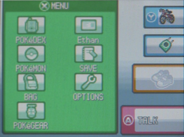
One of the only gripes we had with Pokemon Black and White were that they did not have the excellent user interface of Pokemon HeartGold and SoulSilver. Taking away all the cluttered menus of the previous Pokemon titles, HG/SS put all the menus on the bottom, touch screen and made it all oh-so-easy and user-friendly. It’s a shame Black and White did not feature the same interface- hopefully, Black and White 2 will.
Infinity Blade 2
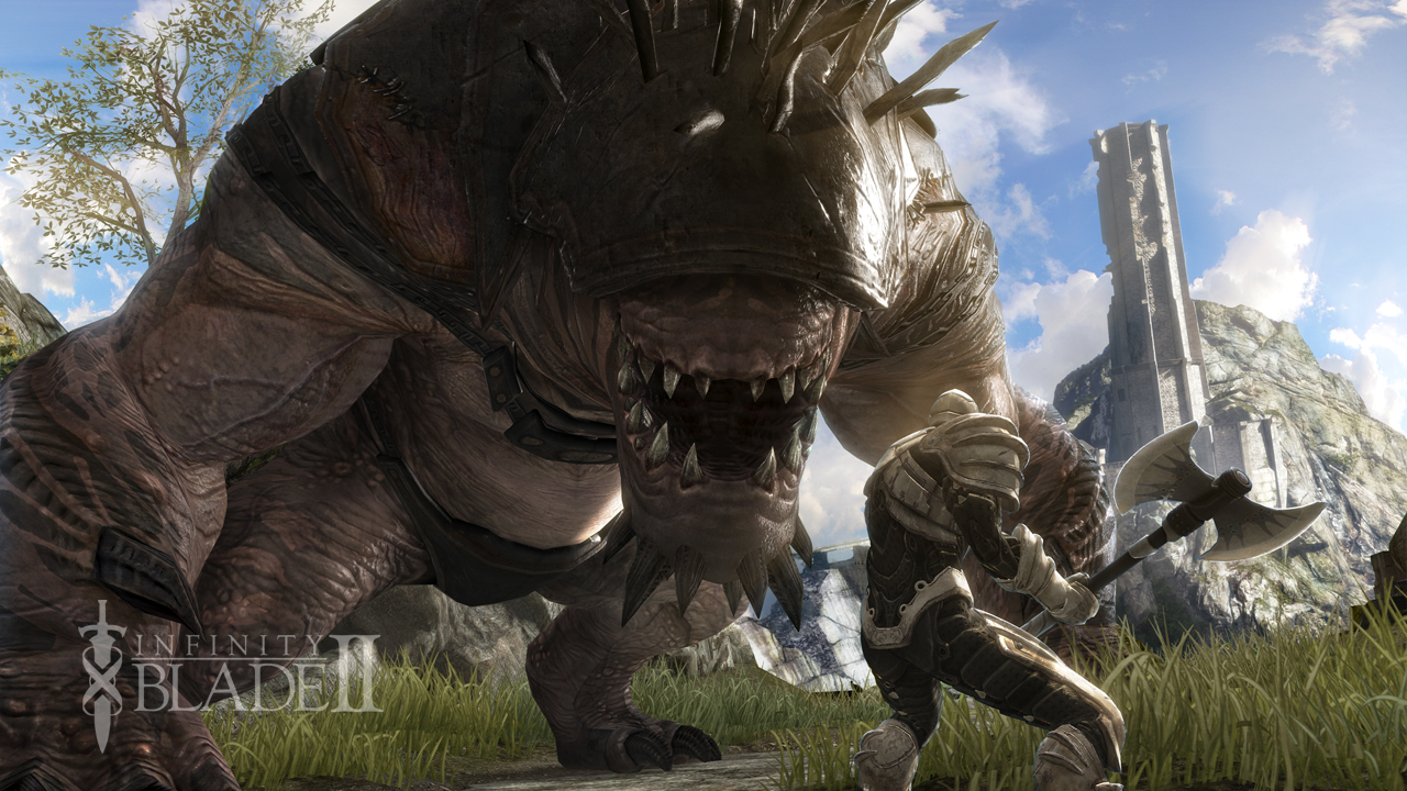
Almost everything IFB 2 did, it did perfectly, and that includes the sexy, neat and clean UI. There was just so much going on on the screen, and not once did we feel that the virtual buttons or the menus were getting in the way of the action. Epic did an excellent job with Infinity Blade 2’s user interface, and it’s probably the best benchmark for iPad games in this aspect.
God of War: Chains of Olympus/Ghost of Sparta
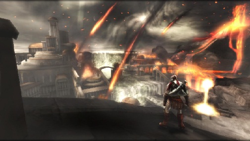
The PSP God of War titles- Chains of Olympus and Ghost of Sparta- were excellent examples of how to port a console game onto a handheld without any significant sacrifices. They basically felt the same as God of War 1 and 2 in almost every aspect. And that includes the menus. While the menus by themselves aren’t noteworthy, it is noteworthy how true to the console versions they were in COO and GoS. The menus were clearly made for console titles, and yet, they were ported over to the PSP perfectly.

