Halo: Reach
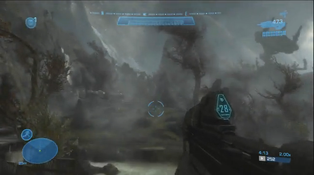
Halo: Reach had amazing art style. True, sometimes it felt like some of the scenes were lifted from Avatar (but they weren’t), but that just goes to show that the art style was, indeed, very good. Windmills in the distance, beautiful mountains, waterfalls, wonderful scenery, and later on in the game, heart wrenching scenes of destruction… the art style was unforgettable, truly, and perhaps the best in any Halo game- and that is saying something.
Brink
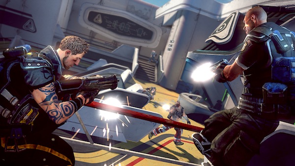
Brink may not be an exceptional game on its own merits, but it did have really good graphics, both, technically and especially artistically. The graphics were neat and clean and sharp, and the art style was creative, refreshing and really good, very pleasing to the eye overall. Some of the things shown in the game did look a bit derivative of other games with a clean art style (like Mirror’s Edge and some others), but overall, the game looked very good.
Killzone 3
Killzone 3’s grey/white/yellow graphical pallet was amazing. The snow levels were absolutely brilliant, the grey, warzone levels more reminiscent of Killzone 2 were great as well, and the game overall looked really, really amazing. The fact that it was technically marvelous as well only helped. And while some might argue that Killzone 3’s visuals were generic shooter stuff, I say this- well, no.


