Sable should be an incredible game. It should at the very least be a game I love. If you just look at the elevator pitch, it practically sells itself – a game all about meditative exploration and discovery in a stylized and distinctive world without combat, with intriguing rich lore and incredible ambience. A game with an approach to exploration and navigation inspired in very large part by the seminal Breath of the Wild, which rewrote the book on open world exploration and discovery in 2017. A game that respects, and indeed relies on, player agency and curiosity and gets out of their way to let them do their own thing.
It’s the kind of game that should be a slam dunk, a home run, a whatever other sports analogy you want to use to convey the fact that this game should be excellent. But it’s not. A total lack of polish, leading to a whole host of technical major issues, as well as some minor unforced errors in terms of design, make this game really hard to enjoy in its present state. The core of Sable is what is probably an incredible game – but it’s impossible to get there, because everything surrounding that core is a total and absolute mess.
The premise of Sable is simple, and in keeping with the minimalism the game is going for – you play as the eponymous Sable, who has to undergo a rite of passage, a sort of coming of age, which sees her having to traverse the world, go exploring ruins, and forage materials and items of various kinds to ultimately find masks. There’s not much of a narrative in the traditional sense – there’s a lot of story to be told here, but the game does a great job of telling it in the background, mostly via environmental cues, and by some key exposition drops during dialog that helps orient the player in terms of what the broader world around them is, and suggests some answers to the question of how or why it is the way it is. This is handled incredibly well, to be honest, and I have zero issues here.
The world itself is aided by some really memorable characters – which is a hell of an achievement, because they’re wearing masks and have no voice acting, meaning the connection you form with them entirely comes down to their dialog and what you learn about them from that. But Sable, the game, makes it work well, especially since every character is consistently viewed and presented to the player via the lens of Sable, the character.
"The core of Sable is what is probably an incredible game – but it’s impossible to get there, because everything surrounding that core is a total and absolute mess."
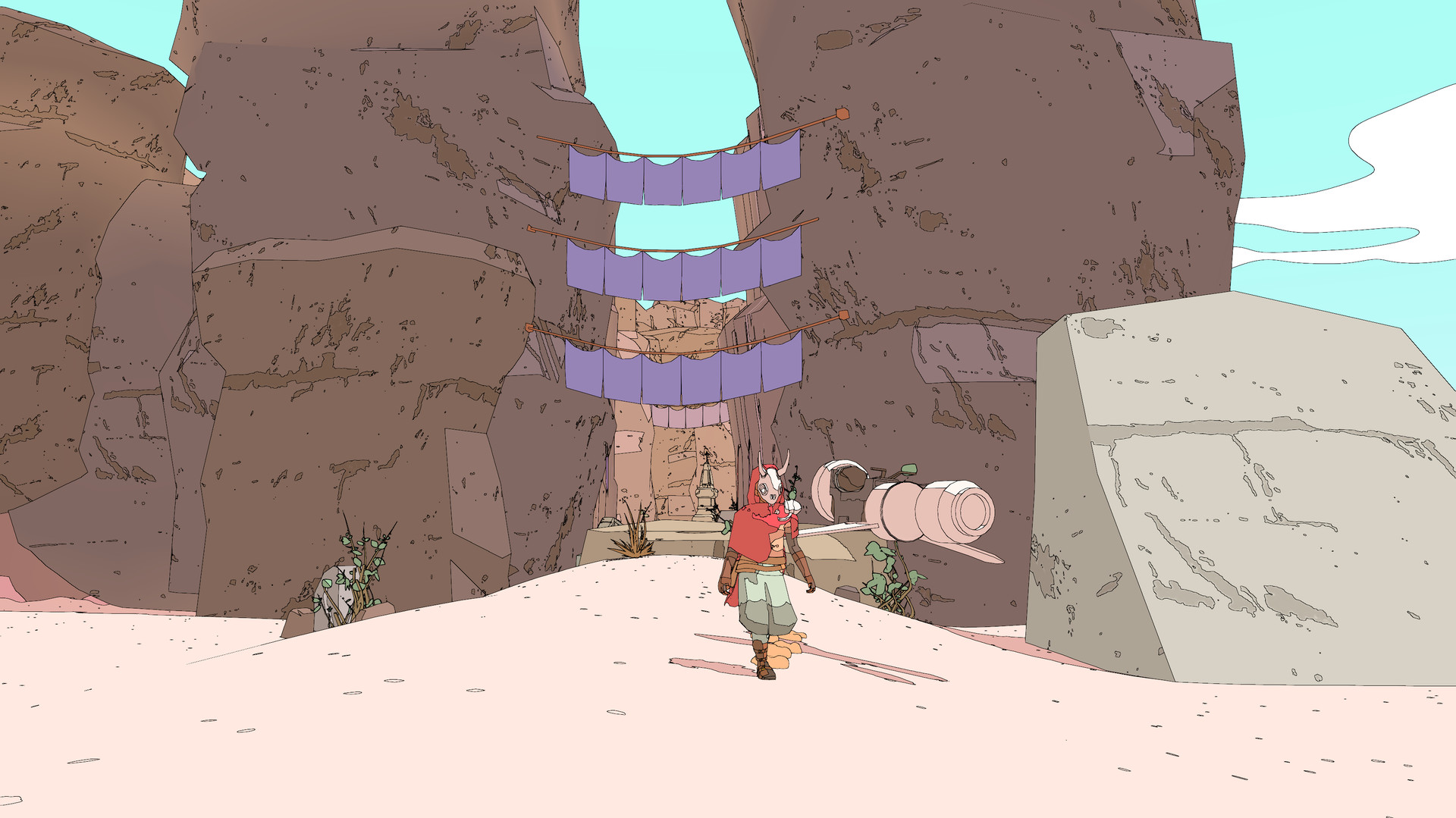
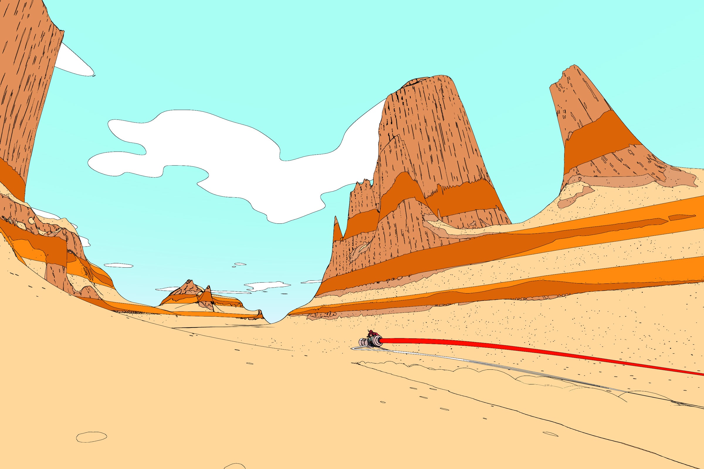
The gameplay also keeps to these values of simplicity and minimalism – as mentioned, there is no combat in this game, and the bulk of what you do is traversal. The game uses a Breath of the Wild style stamina system that governs sprinting and climbing, and fairly early on in the game, on gives you the ability to hover via a special item as well. You also get a vehicle (initially a barely held together hand me down, but ultimately a hover bike, to help you trek across the vast expanses of this game’s gorgeous world.
But really, it’s here that the game starts straining at the seams. A game about traversal (and only traversal) across a vast world should feel actually good to control. Sable does not. The controls are outright clumsy, ranging from weird and unintuitive button mapping choices (which you cannot change), to movement for Sable herself that just doesn’t feel right. There’s a strange sense of inertia to her movement that is entirely at odds with how you see her move on screen, and it can take a lot of time before coming to terms with the controls – I personally never did.
These control issues are compounded by camera issues on top as well. The camera in Sable does not control well. There is some weird acceleration to its movement that never quite feels right. You can actually change this in the settings, which give you the option to tweak X and Y axis sensitivity individually, and that may help you figure out a setting that works well for you – but again, as far as my experience goes, I kept butting heads with the camera. This comes to a head when you are trying to navigate in cramped spaces – of which there are many in Sable – because the camera simply doesn’t know what to do there, and ends up trying to cut through the geometry to Sable herself, and showing you a whole lot of – well, nothing helpful, really, mostly it just serves to infuriatingly change your field of vision from where you need it to be.
But to be honest, there are many games that have poor controls or cameras that I have been able to abide with because the core game is compelling. Sable certainly has some great core design that just invites the player to lose themselves in its endless expanses – the minimalist approach it takes to everything else translates to the exploration and discovery as well, giving the players very little in the way of a HUD or markets, and generally relying on diegetic and in-game cues to orient and guide the player. You ultimately do get a compass, which is excellently implemented, in that when you press the left bumper, it gives you the general direction of your current quest objective, and then disappears shortly thereafter, for players that need to orient themselves. Ultimately, you also get the ability to place beacons and markers in the world to help you navigate further. These are all great ideas, and I sincerely hope other open world games learn from Sable in this regard, particularly ones that rely on diegetic cues for navigation and immersion.
Unfortunately, we run into issues here as well. The world is gorgeous thanks to the art style (though this art style has issues of its own – more on that in a bit), but a lot of the content in it feels disappointing. A lot of the puzzles are bland and unremarkable, and a lot of the quests are very straightforward and trite. That means that not only is the actual act of traversal and playing the game made unpleasant thanks to the controls and camera, but that what you are doing after you have finished fighting said controls or camera isn’t very compelling either – definitely not compelling enough to justify the friction necessary to get to it in the first place. And that’s before I get into the technical issues.
Oh, the technical issues! I played Sable on an Xbox One X. Now, I understand this isn’t the latest and greatest hardware anymore, but it’s still an Xbox One X, it’s pretty damn powerful, certainly more than capable of running this game. However, Sable falls apart like a piñata spilling its guts all over the floor. It barely runs on Xbox One.
I had two crashes while running the game, including one where it refused to start the first time I booted it (which should have clued me in on what to expect, really), and once where the game just froze, and my Xbox itself stopped responding, needing me to unplug the whole thing after waiting a few minutes to address the freeze. But the crashes are actually the least I was put off by the game’s technical issues – no, the technical problems that bothered me the most are all graphical and performance related.
Let’s talk about the performance issues first. Sable can barely hold a steady frame rate. At all. At any time. Simply walking across the world with nothing going on can cause huge stutters and drops. Remember, Sable has no combat, so we’re not talking about drops during encounters with loads of enemies on screen and loads of calculations happening in the background – it drops frames simply as you are walking through the world or talking to NPCs, with zero provocation, and it drops them aggressively.
Then there is the pop in, which you wouldn’t think is possible in a game like Sable, which is hyper stylized. But nope, I see the game populating colors and textures literally right as I step next to them, which, combined with the frame rate, cam be extremely distracting. Indeed, the camera acceleration, the frame rate drops, and the game randomly popping in colors and textures as you walk up to them, combined, create a package of a game that is so uneven to play and control that it made me physically nauseous.
I have an extremely high tolerance for poor frame rates – I am able to play most games on Switch that are notorious for poor performance without ever batting an eye, but Sable is the first game in over a decade that made me physically ill to play, because the consistent framerate drops and awfulness of the camera just give a sense of strong nausea and persistent queasiness that is really hard to shake off even after you stop playing.
Sable’s technical issues are not limited just to graphics and crashes either – for example, the load times are extremely long (at least the initial load), the game can see the player caught in geometry with no escape (though you can quick travel), quest triggers sometimes fail, and I had at least one occasion where the game didn’t read my inputs right away – though I am honestly not sure if that was more because of some animation priority it was getting through first, or if it’s an actual bug.
"I am all for stylization in game graphics. But stylization should never be at the expense of the player being able to pick up on cues in the game world and general legibility, and Sable fails to cross that bar. I have to assume it’s even worse for people with accessibility considerations, and on the whole, I am not sure why no one stopped to consider the gameplay implications of their graphical choices when designing their game."
Put together, the game barely manages to run in any acceptable state. As it stands right now, Sable on Xbox One, any Xbox One, is functionally unplayable. I am given to understand that it’s not quite as bad on Series X and PC, though I am also simultaneously given to understand it’s still a buggy mess on those platforms – the bugginess just seems to be a part of the package here.
I also want to talk for a moment about Sable’s art style. It’s stunning to look at, isn’t it? Well… it is, mostly. Unfortunately, here, too, I have several complaints, mostly in the fact that the game seems to prioritize aesthetic over articulation and legibility. What this means, put simply, is that it is often impossible to be able to distinguish details in the environment without really straining your eyes, something that is especially an issue when it’s dark in the game. Because when it’s dark, the game “bleaches” the environments of color, so to speak. Since the intensity of color is actually the primary indicator of things, this can make navigation really difficult – especially when you consider that this, along with the general illegibility of the art style, and the performance issues, the control issues, and the camera issues, all add up, and can be very literally headache inducing. Even in less aggressive instances of this “bleaching”, such as when you’re outdoors and it’s nighttime, it can be extremely difficult to actually meaningfully navigate the world when this happens.
I am all for stylization in game graphics – in fact, my favourite looking games of all time are all those that eschew realism and go for a stylized look, from Persona 5 to the aforementioned Breath of the Wild. But stylization should never be at the expense of the player being able to pick up on cues in the game world and general legibility, and Sable fails to cross that bar. I have to assume it’s even worse for people with accessibility considerations, and on the whole, I am not sure why no one stopped to consider the gameplay implications of their graphical choices when designing their game.
As far as the Xbox One goes, I cannot recommend Sable. It’s outright unplayable as things stand right now. But here’s the thing, if/when these issues are addressed in future updates – and they can all be patched out, from the performance issues, to adding control remapping options, to toning down the aggressive graphical filters, to making the camera behave better, to patching out the hard locks and crashes, to fixing draw distances, all of that – if that happens, this is going to be a good game. I don’t think it will ever quite be great, because even apart from the technical problems I have, I have mentioned enough issues with its quests and gameplay loop that are too fundamental to what it is. But I do think this can be a legitimately good game that is great to just lose yourself in for hours, wandering around, taking in the sights, exploring it for the sake of the joy of discovery and the melancholic story that the world has to tell.
But it’s not there yet. Look, I’m not unaware of the context of this game’s development. I know it’s a passion project developed by less than a half dozen people. I understand that they pulled off something of this scale with a team that small, especially in the middle of the COVID-19 pandemic, which disrupted developers with far more established pipelines and processes in place. And I really respect that, I think it’s amazing that they did that. And I think the core here is certainly good, even if it never transcends its own problems to become something truly great. But unfortunately, even with all those considerations, there are far too many problems with the game as it is right now for it pass muster. There’s a kernel of something good in here. But all of it is undermined right now by just what a shockingly shoddy state the game is in.
Maybe one day, Sable will be a good game that I can spend hours losing myself to and that I can recommend to others. Today is not that day.
This game was reviewed on Xbox One.
The minimalist exploration and discovery, and the central design of the world; some very memorable NPCs; some extremely smart diegetic and in-game cues to assist players with navigation.
Terrible technical issues (to the extent that simply walking through the world can tank the frame rate); poor camera acceleration and controls; stylization can get in the way of in-game eligibility, especially in darker areas; poorly optimized, with crashes and hard locks; the quest and puzzle design can often be simplistic.


