Konami’s Silent Hill 2 is considered to be one of the best horror games of all time, and for good reason. The legendary status of this game can be attributed to its ability to get under the player’s skin with its ominous vibe and constantly shifting story alongside gameplay elements that strongly resonate with the narrative’s themes. It’s a very well-designed experience that has stayed with countless players over the years, and Bloober Team has tried to recreate the same magic in a new light with the Silent Hill 2 Remake.
Game Engine
As previously mentioned, Bloober Team has used Epic’s Unreal Engine for this project, and the team has certainly shown signs of maturity after working on the same tools with its previous Layers of Fear project. Silent Hill 2 Remake makes good use of features like Lumen to create appropriately spooky vistas that reflect how light behaves in a realistic fashion. The rendering pipeline also consists of other visual effects including but not limited to volumetric light shafts, dense smoke volumes, and Nanite for geometry among others.
Let’s start things off by taking a look at the character models since they seem to be the biggest point of contention among fans leading up to the game’s release. Speaking purely in technical terms, the character models look great thanks to high polycount resulting in great-looking skin meshes. We also get to see fine strands of hair with minimal artifacts coupled with appropriate physics movements for the same. The clothes are comprised of physically based materials, and they look great with proper texturing and attention to geometric detail.
The art direction remains questionable though, since clearing up the facial models strips away some of the charm that existed in the original. Konami had to hide low levels of detail and crude textures had to be hidden through clever use of shadows on the PS2, resulting in a very fitting image given the psychological horror themes of the narrative. The remake makes certain changes to the models themselves and soft skin meshes can make certain characters look rather offputting at times. These changes are more pronounced in characters like Angela and Harry, but again that’s more to do with the art direction itself than a technical inefficiency.
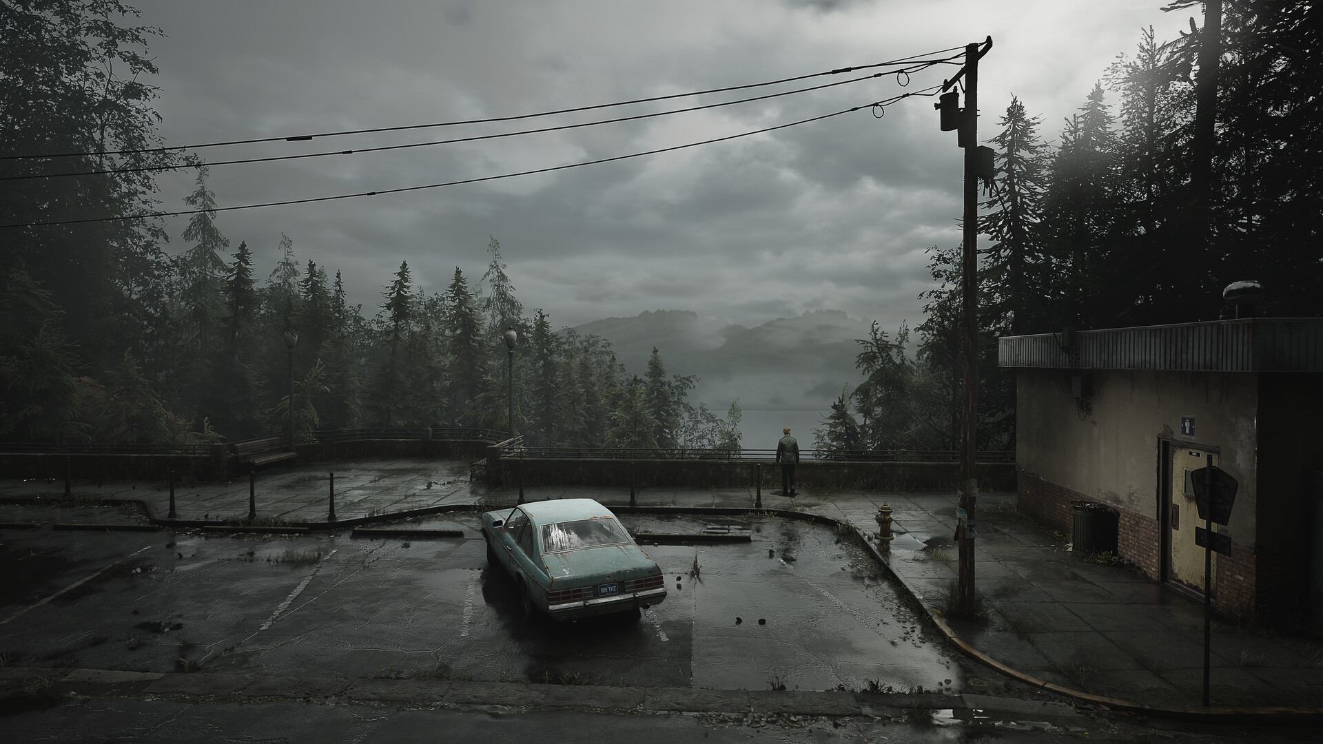
Switching gears over to the environments, we get to see some nice use of Nanite with dense texture meshes scattered throughout its spooky world. The global illumination solution does a good job of creating a convincing look throughout, balancing direct and indirect lighting well across a bunch of challenging scenarios. Ray tracing is being used for bounce lighting and reflections, and the latter can be seen very clearly in various puddles and water bodies reflecting their surroundings with great precision.
Smoke volumes play a significant role in the atmosphere of Silent Hill 2, helping to establish a haunting vibe reminiscent of the original game. While these dense smoke effects are prominent throughout, the animations that occur as players move through the smoke feel somewhat rigid and could use some work. But generally speaking, Bloober Team has done a good job of crafting a solid post-processing pipeline that embellishes the image presentation with effects like depth of field, motion blur, and high-quality alpha particles in combat.
Head-To-Head Comparison – Original Vs Remake
Now let’s take a look at some iconic scenes from the original and the remake to get a better understanding of the changes and graphical updates that have happened between the two versions.
The Opening Sequence – Mary’s Letter
The opening sequence of Silent Hill 2 sees our protagonist James Sunderland receiving a mysterious letter from his dead wife Mary, asking him to seek her out in this special place. This is an iconic scene that does a great job of setting up the perfect tone for events to follow, and the remake retreads a familiar path in broad strokes. The cinematic has been cleaned up by a significant margin, and the visible grit in the original is replaced with a markedly cleaner aesthetic this time around.
The shots are framed mostly the same, and the difference between the environmental details is exponential. The level of detail in distant objects like trees and the lake is crisp, and the generous smoke volumes help to set the right mood for the events to follow.
Meeting Eddie in the Apartment
The baseball hat-wearing Eddie is one of the major characters that James comes across during his adventures in the twisted town of Silent Hill. When you first meet Eddie, he can be found puking in the toilet seat – struggling to exchange words with James about what really went down here.
This particular scene in the remake looks a lot darker in comparison to the original, with grey and black being the dominant tones throughout the scene. A major difference between the two versions is that we don’t get to see Eddie up close during the conversation in the original, while the remake does give the player a clear view of his facial model during this instance.
Unlike the original where the bathroom has faint lights that put Eddie in clear view of the scene, the majority of direct light in the remake comes from James’ flashlight which works because of current generation GI implementation. This scene also gives us a good view of the efforts that Bloober Team has put into recreating the environments with a consistently high level of detail, and how that helps in achieving the desired look. Note how the tiles in the bathroom have a thick coating of dust layered across them, which not only affects the material’s ability to reflect light – but helps contribute to the gritty aesthetic of the game.
Meeting Angela in the Apartment
Angela is one of the more important characters in the story, and James meeting her in the apartment is a major story beat for the game’s narrative. She can be found lying in the corner of a room with a knife in hand. It’s a rather impactful scene with strong dialogues and good use of cinematic framing, and it’s safe to say that the remake does justice to this one as well.
The choreography of the two cutscenes is largely the same across both versions of the game, and this scene acts as a great showcase for the impressive lighting and post-processing effects in the remake. Unreal Engine 5’s depth of field effects can be seen when the camera juts in close to Angela, putting her in focus while blurring James at the back without revealing any visible artifacts along the edges of her clothing and hair . High-quality reflections can be prominently seen on the shiny edge of Angela’s knife and the mirror itself, and that enhances the visual flair of the scene. Indirect lighting is rather minimal thanks to mostly rough surfaces and quaint light sources, but it appears that Bloober Team might be utilizing additional cinematic lighting techniques to better highlight the action.
First Monster Encounter
Silent Hill 2 is a survival horror game at its core, and it makes good use of elements like building tension and foreshadowing horror to unease the player from the very core – and the first monster encounter is emblematic of those very strengths. We see James coming face to face with a creature that looks like an unimaginable nightmare with its malformed body and ugly textures.
The remake delves further into these elements of foreshadowing horror and building tension as we initially get just a glimpse of the monster while you are out and about exploring the deserted town of Silent Hill. The game takes you through a sequence of following blood trails and clues before you are finally confronted with the horror itself, and then you are thrust right into the deep end with a combat encounter.
Animations
The original Silent Hill 2 operates on the same framework of tank-style controls as most horror games of the time, and the remake changes that to a third-person perspective which is more suitable for modern audiences. The combat has also been changed drastically from the original, swapping the basic options for a more fleshed-out system where you have to preserve your ammo and properly line up headshots to ensure your chances of survival.
The change in perspective also means that animations have been revamped by a significant margin. Unlike the primitive animations of the original, the remake features smooth animations for both the player and enemies. Combat works flawlessly as one animation seamlessly blends into the other. Enemies also twitch restlessly and cover distances swiftly, adding to the element of horror while also adding a lot more variety to the moment-to-moment gameplay.
Conclusion
In conclusion, Bloober Team has done a great job of putting a fresh coat of paint over this classic. The team has made good use of Unreal Engine 5’s suite of visual features to create an appropriately chilly horror setting. While there are definitely a few rough edges like changed environmental lighting and character models, the remake does a good job of creating its own identity without compromising on what made the original game so special in the first place.


