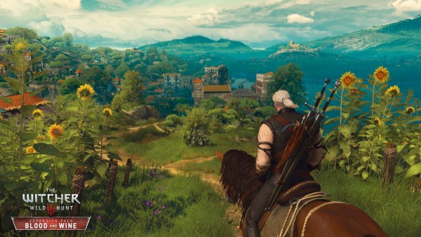
The Witcher 3: Wild Hunt does a lot right – it would have to, otherwise we would not have given it the 10 that we did – but one of the things that it dropped the ball on was the interface and UI. The game’s menus were unpleasant to look at, and an organizational nightmare. Over time, there have been fixes made to the UI to make everything slightly more manageable, but the fact remains that it’s a band-aid fix for a deeper rooted problem.
With the release of Blood and Wine, the second and final expansion for The Witcher 3, which launches later this month, that problem will be addressed head on by CD Projekt RED. Multiple changes have been made to the UI, including visual and aesthetic, but also functional ones, such as much needed changes to the skills and inventory screens. You can check out this changes in comparison screens, courtesy of GamePressure, below.
The Witcher 3: Blood and Wine will be out on PS4, Xbox One, and PC on May 31.


