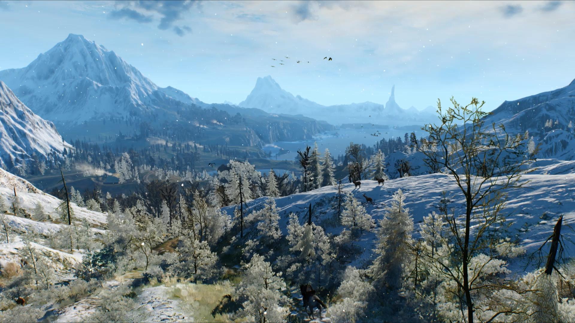
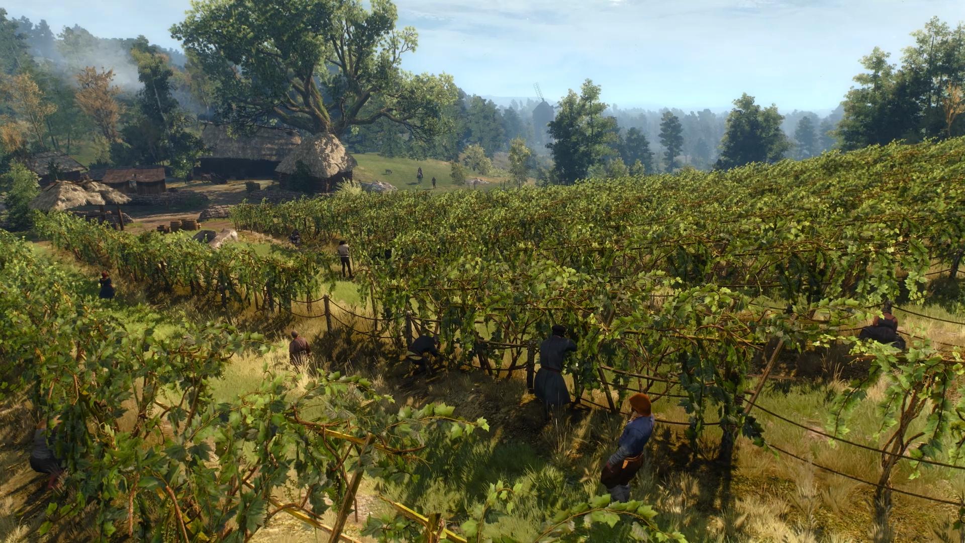
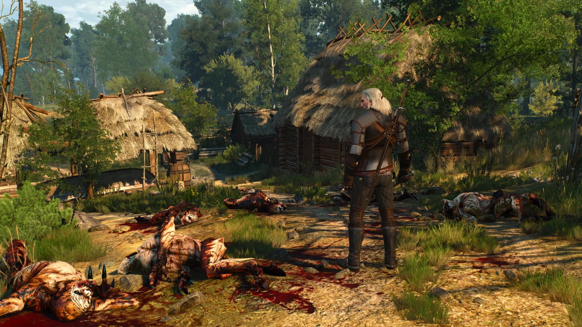
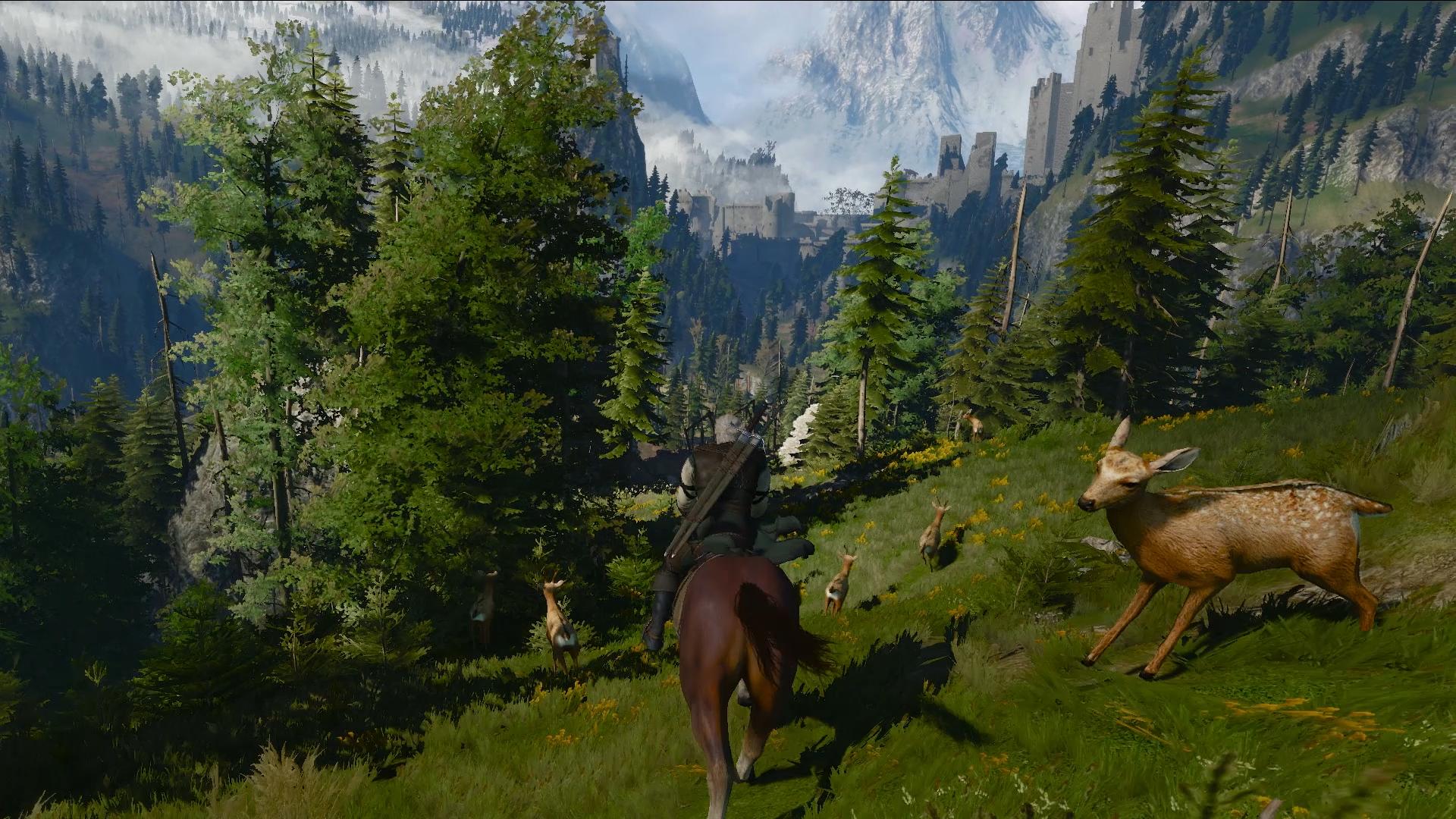
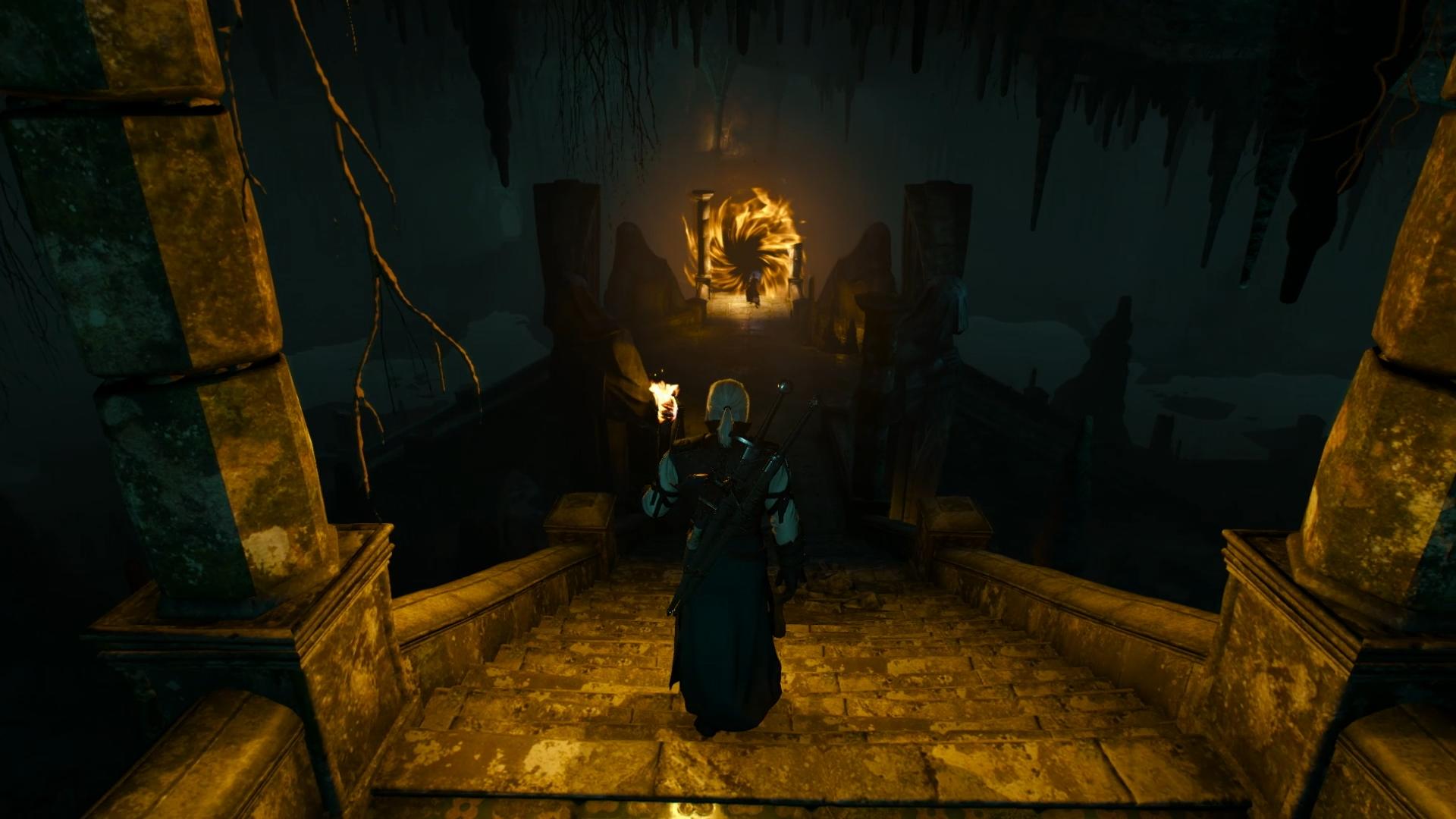
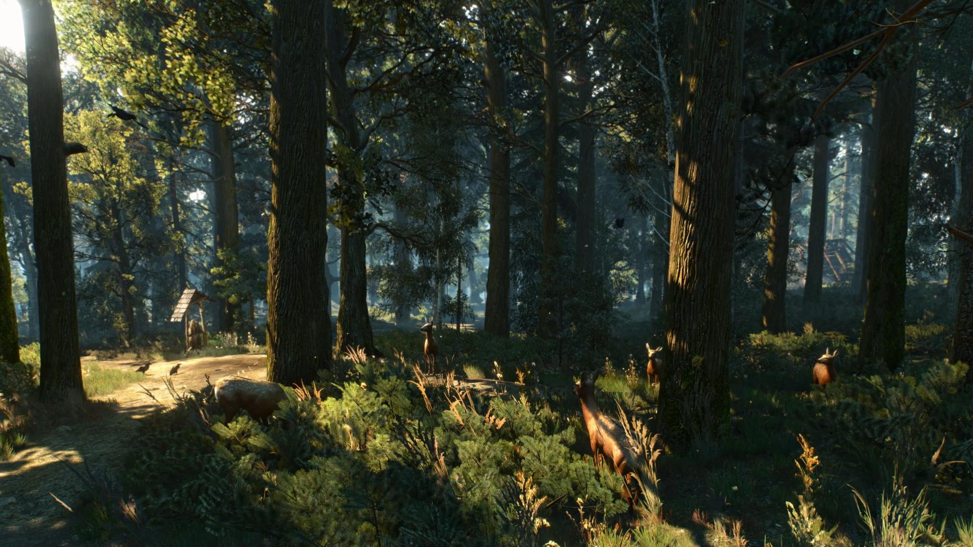
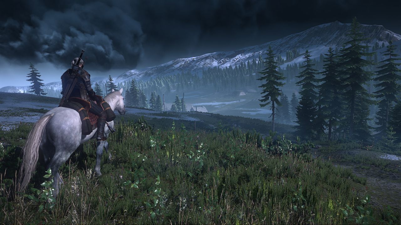
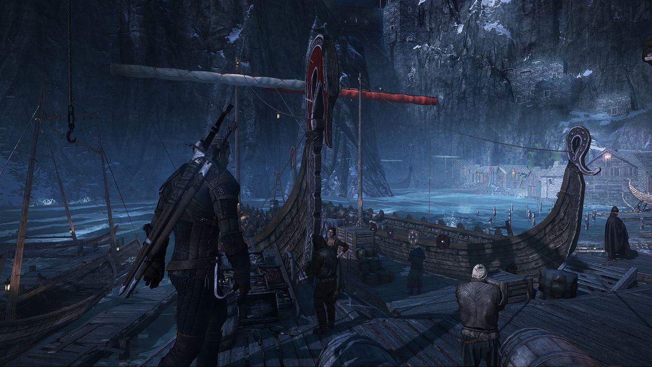
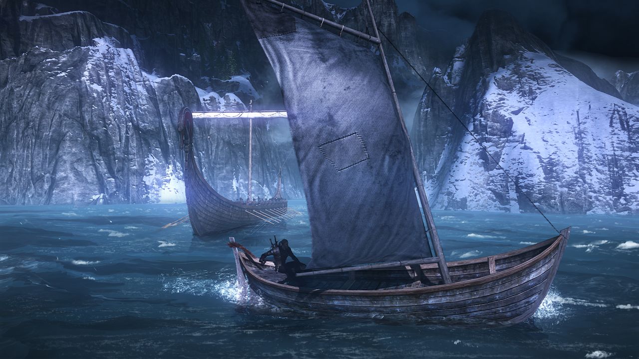
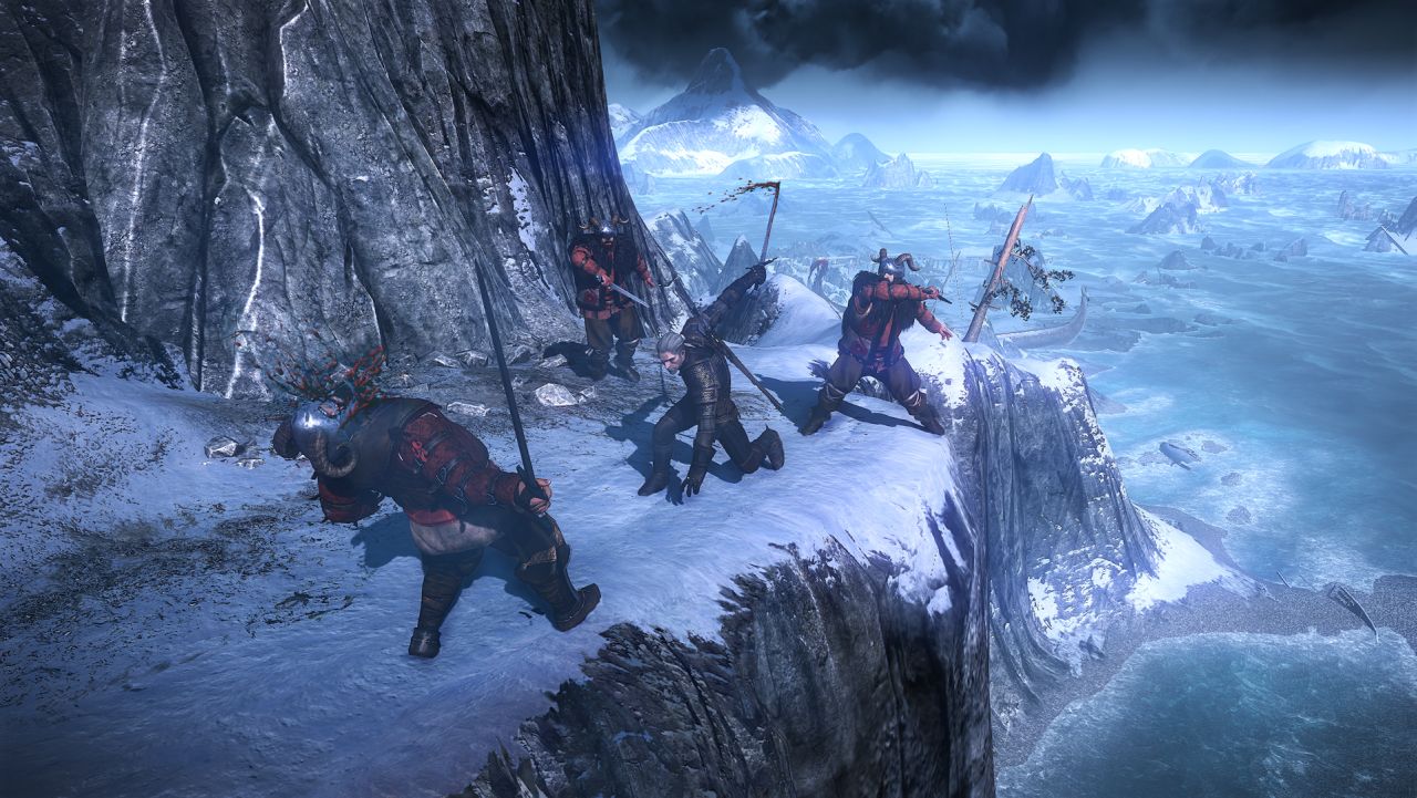
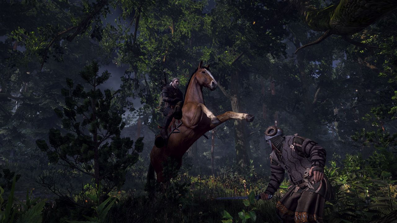
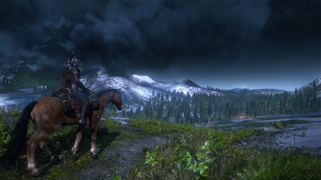
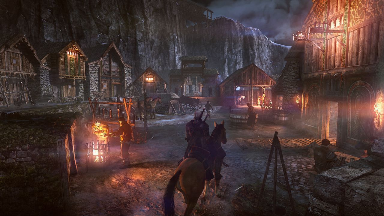
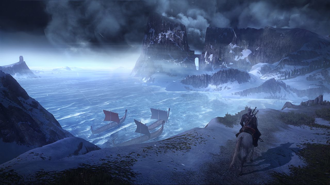
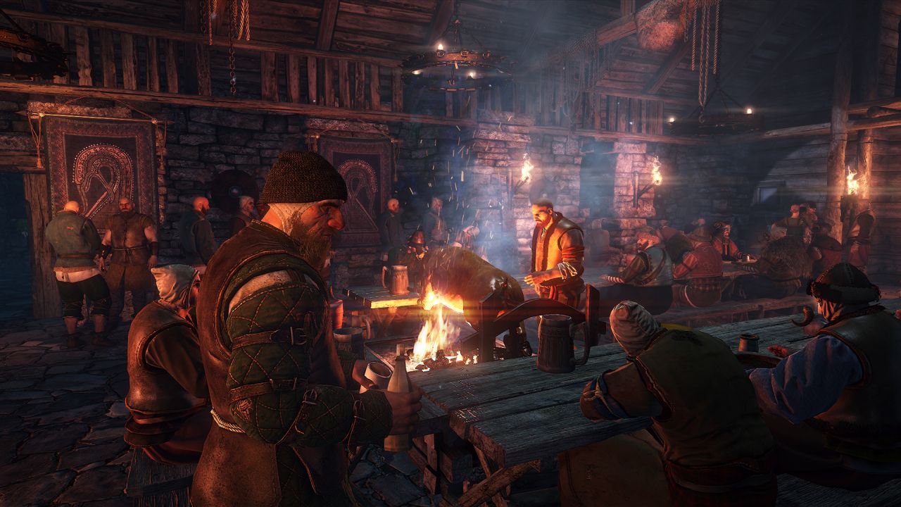
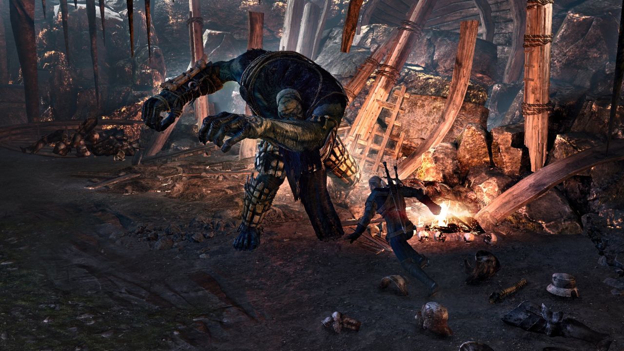
Ever since The Witcher 3: Wild Hunt was revealed back in 2013, the game was shaping up to be one of the most realistic looking title on the market. But since then, it seems that there has been a major shift with regards to the visual direction of the game. Rather than looking realistic, the game is now looking more natural, colorful and vibrant.
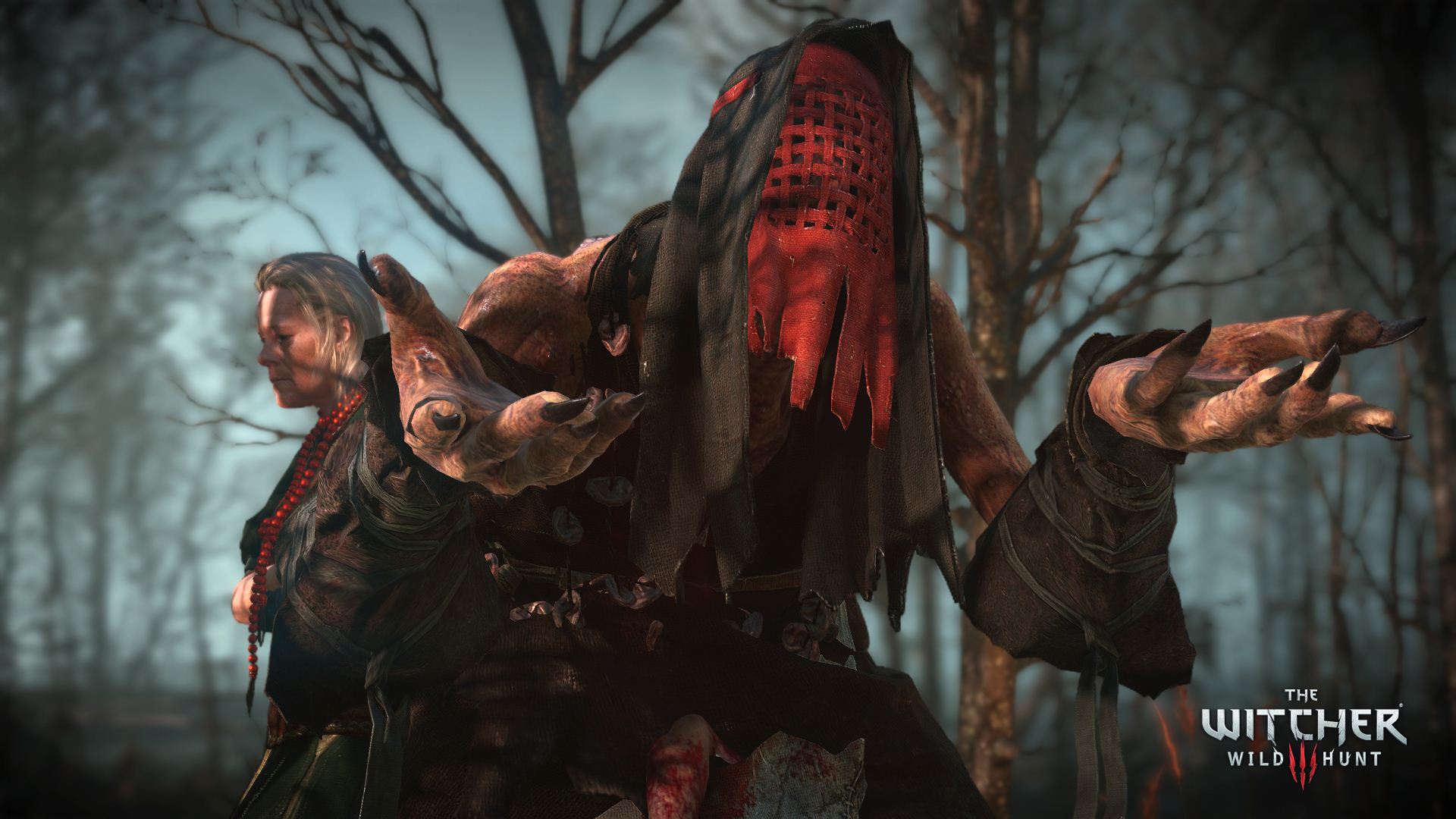
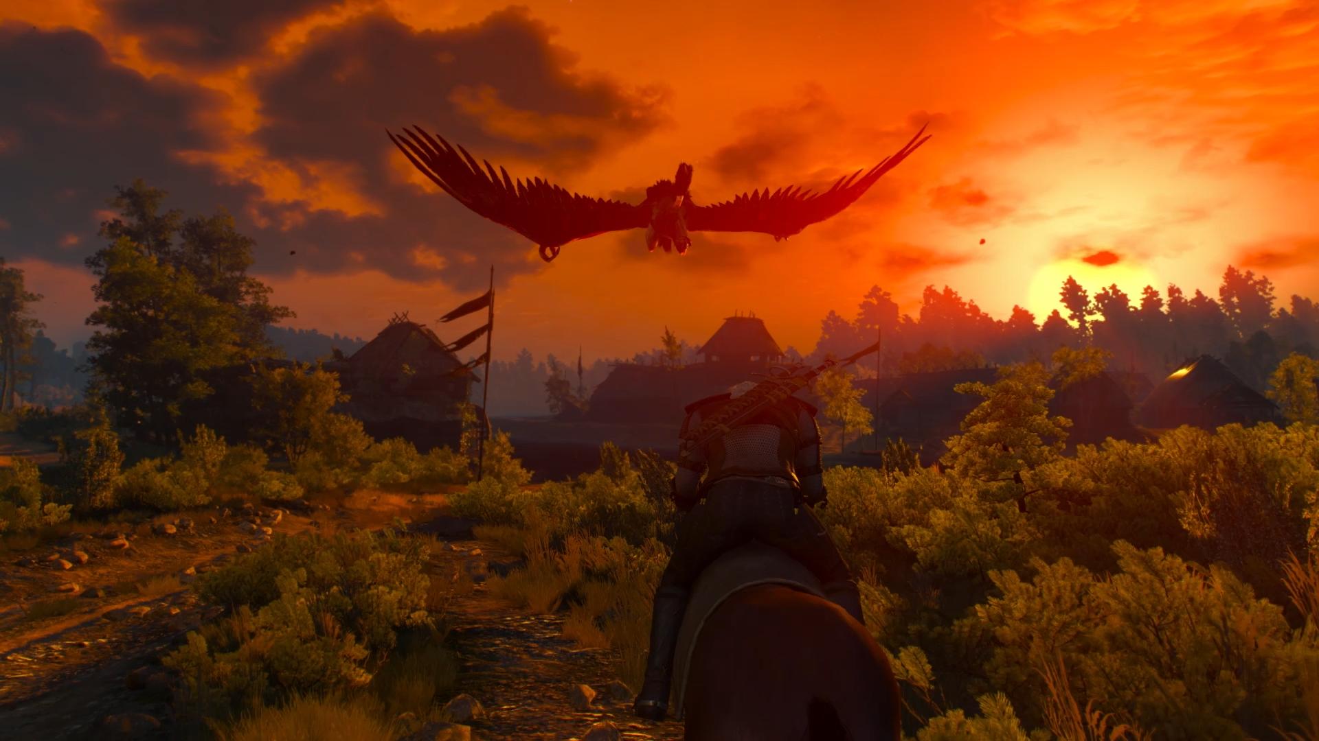
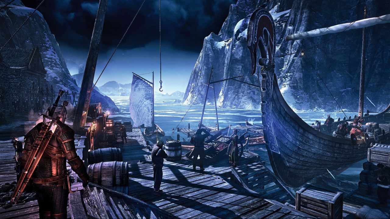
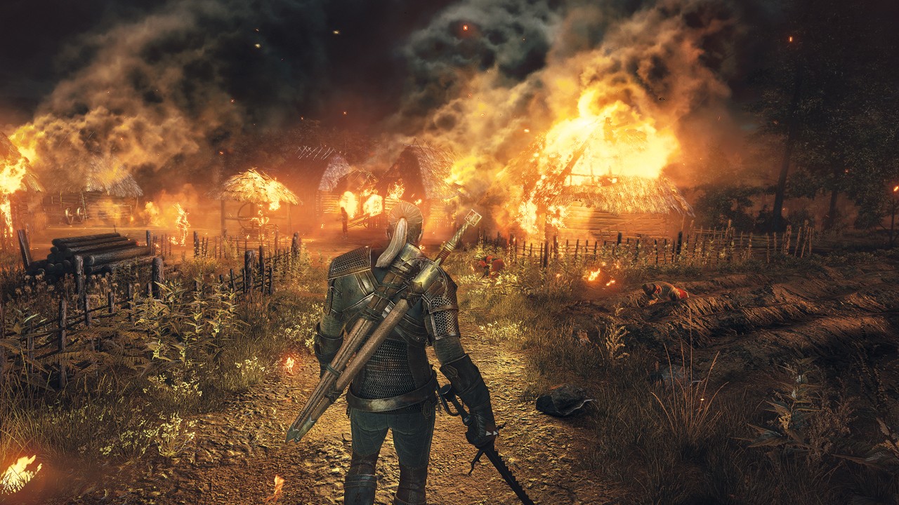
As showcased in the screenshots below, the game initially had a very realistic tone to it. Compare it to the screenshots captured from the latest gameplay trailer and you will observe that there is a shift in the rendering tone of the game. This does not mean that the game was graphically downgraded and in my personal opinion, the game is actually looking better compared to the serious look and feel of the original.
The Witcher 3: Wild Hunt comes out on May 19th, 2015 across PlayStation 4, Xbox One and PC. For more on the game check out our wiki here or our hub page here. Let us know your thoughts in the comments section below and stay tuned for more news and updates on GamingBolt.
Screens from latest build:
Old build from 2013:
Thanks to Neogaf user 5olid_5nake for the screenshots.

