More detailed map screen
The mini-map is often the most important part of a game’s HUD, and this rings especially true for a game as open-ended as the Witcher 2. The mini-map really needs to be made clearer and easier to read for the 360 version of the game, as it just wasn’t cutting the mustard on PC. The same, surprisingly, needs to be said for the game’s main map. I don’t know if it was the legend, colour scheme or general presentation, but the map screen was often tough to read and take in. Some changes need to be made to these by the time we see the Witcher 2 again at the end of this year.
Better inventory/character management
It’s a problem that seems to plague most console RPGs, but the inventory and skill management systems in the Witcher 2 didn’t really respond well to controller input. The inventory screen wasn’t too bad, though the selection cursor was a little tricky to spot. The main problem was the skill upgrades screen. Something about it just didn’t work well with a joypad, with some directions not being properly registered. These are small niggles, but they will help make the 360 version of the Witcher 2 that little bit more polished if they are rectified.
A better synopsis of the story so far
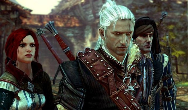
So, how did these two get together again?
With a few hours of play under my belt, I’d begun to understand the intricacies of the Witcher’s world and lore. For the first few hours of the Witcher 2 however, I was pretty lost as to what was going on. With the Witcher 2 taking place directly after the events of the first, console gamers who haven’t played the first game will be left at a disadvantage. With it seeming unlikely that the original Witcher will get a console re-release, CdProjeckt will have to find another way to bring console players up to speed with the continuing adventures of Geralt or Rivera.







Share Your Thoughts Below (Always follow our comments policy!)