SONIC (SONIC THE HEDGEHOG)
No, we’re not talking about the movie, though we could probably write a whole essay about his well-publicized visual overhaul for his debut on the silver screen.
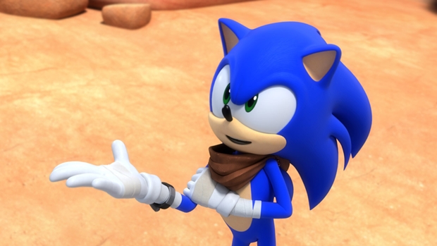
Unlike the movie, Sega pretty much nailed the blue super-speedy hedgehog’s look on their very first attempt. Since the days of Sonic the Hedgehog on the Sega Genesis in 1991 to some of his more recent appearances in games like Sonic Mania and Sonic Forces, the iconic mascot’s design has remained largely the same. He sports a few key visually indicators that make him instantly recognizable, more so than most video game characters. His spiky hair, his massive eyes, his white gloves, his red shoes, and, of course, his blue colour are all things that we have always associated with Sonic.
And these are things that Sega have kept intact for the character throughout the ages. There have been some modifications here and there, sure- for instance, Sonic 3D Blast showed him with a fuller belly and stick-thin arms, while games such as the 2006 reboot (we’re sorry we have to mention it) and some that followed it, such as Sonic Unleashed and Sonic Colors saw his blue spikes getting much longer and pretty much looking like waist-length hair. By and large, though, his design has remained the same, minus the flourishes and details Sega have kept on adding as time has gone on, much like what Nintendo have done with Mario.


