A new style of architecture
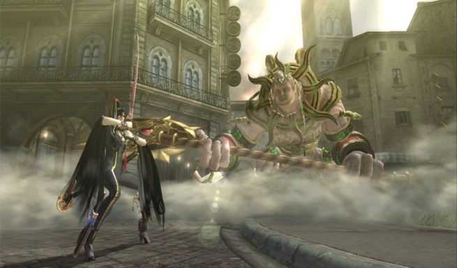
This isn’t necessarily something that Bayonetta did wrong, more an aspect of the package that I think could be pushed further for a sequel. Bayonetta had a fantastic and refreshing use of European architecture throughout the game, but it would be interesting to see what other kinds of visual styles the franchise could employ. It would be easy for Platinum Games to fall back on what worked in Bayonetta but, considering their usual skill in the visuals department, I’d like to see what they’d do if pushed outside their comfort zone for Bayonetta 2.
A decent PS3 port
An unfortunate mistake indeed that should not be repeated. The PS3 port of Bayonetta was all over the shop. With screen tearing, frame rate issues and unspeakable loading times, Bayonetta was an inferior experience on PS3. That kind of degradation between platforms is inexcusable in our modern generation, and it lead to many PS3 owners getting a poor representation of the Bayonetta experience. Let’s get the port right next time people.
Less repetitive structure
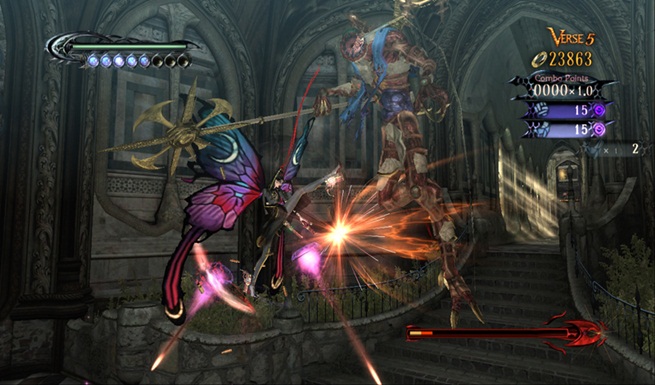
The only solid criticism I had with Bayonetta was its repetitive structure. Aside from a few linear platforming and exploration segments, the game generally lead you from one encounter to another. Admittedly, the repetition was alleviated by the game’s inventive style and addictive combat, but a more varied game structure would really help Bayonetta 2 exceed even the wildest of expectations.


