With the last few games in the series being the smash hits that they were, the Yakuza franchise has morphed into a global phenomenon with more and more fans flocking to experience with each new release. While most Yakuza games are available for fans to enjoy around the world, there’s also a hidden gem in the form of Like A Dragon: Ishin! which was released for the PS3 and PS4 exclusively in the region of Japan.
Like A Dragon: Ishin! is a spin off title set against the backdrop of the Edo period of Japan, and follows the adventures of Sakamoto Ryoma as he investigates the murder of his mentor while dealing with his existential crisis. Suffice to say, the game is a cult classic and now that a large audience has eyes on the franchise – this is the perfect time to remake this classic and the developers have done just that.
Like A Dragon: Ishin! for modern platforms is a smart remake of the original, both in terms of graphics and gameplay. But for the purposes of this feature, we will be focusing on the former category and to that end, we present a complete graphics comparison for Like a Dragon: Ishin!
Engine

The original Like a Dragon: Ishin! was the developer’s foray into eighth generation console development, but the developer didn’t use its latest in-house Dragon Engine for the project. Instead, the game was built using older in-house tools which is precisely why the game feels visually dated when compared to other PS4 launch titles like Killzone: Shadow Fall or Knack. The remake is being built using Epic’s Unreal Engine 4, and while the decision to go with an external game engine over its in house Dragon Engine seems rather weird – the developer revealed the reasoning behind this choice in a recent interview with Crunchyroll.
He explains that the Dragon Engine was specifically built to render nighttime scenes illuminated by neon boards and streetlights, and it worked well enough for the mainline Yakuza games. But with Ishin, the engine struggled to do ambient lighting and reflections for daytime scenes which is why the team decided to use older tools for the original and also Unreal Engine 4 for the remake. While I am no game developer, it’s fair to say that the decision should have resulted in a smoother development process which shows in the final product. Suffice to say, the remake looks a lot better in this new form and this serves as a good jumping off point for all the improvements that we will be discussing in further sections.
Character Models

Like a Dragon: Ishin! in its original version features character models with fidelity levels of what one would expect from a late PS3 and Xbox 360 era game. It’s fairly detailed, but there are visible cracks all around. The skin meshes are mushy and the hair looks really artificial with lacking textures, and clothes feel very bland in terms of colors and texture depth. All of this results in a rather flat looking presentation, which doesn’t hold up all too well against modern landscapes. Character models also tend to stick out against the environment, because the game seems to make heavy use of pre baked lighting data for many light sources which don’t really affect a model that’s far away from the camera.
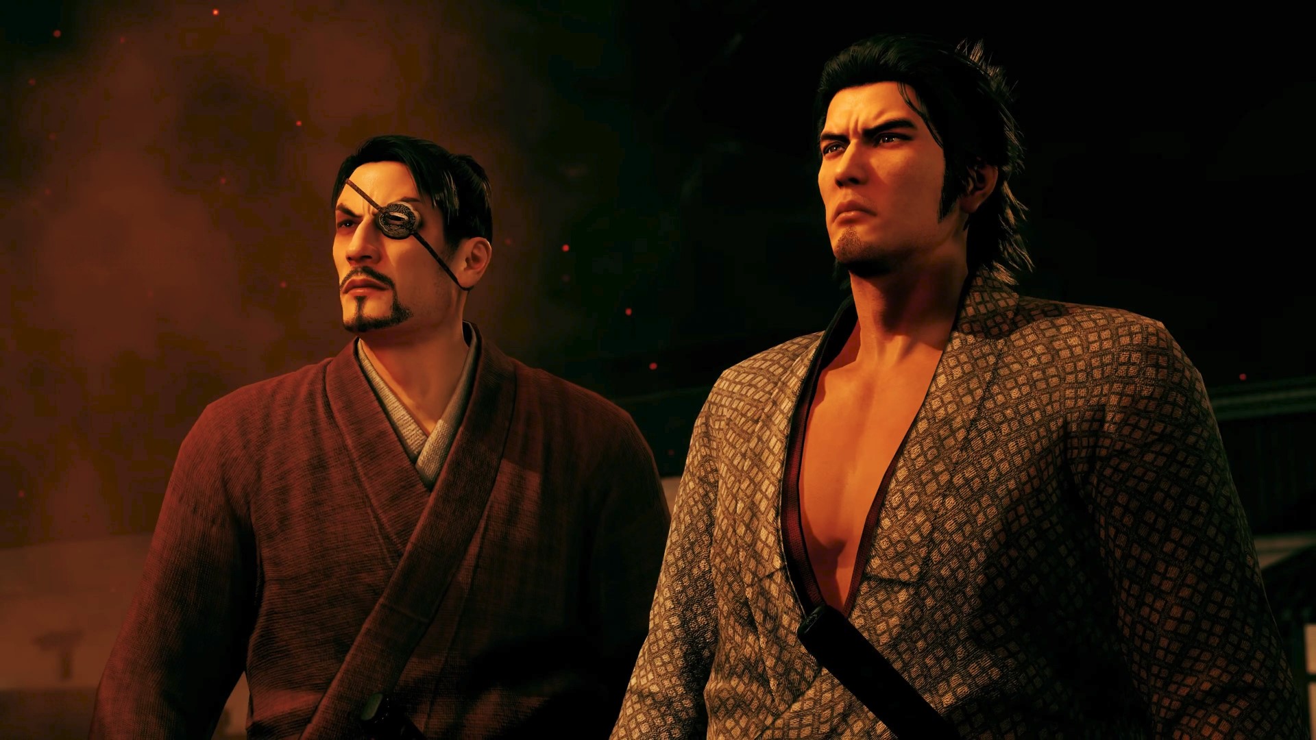
Thankfully, most of these criticisms have been rectified with the remake, where we get to see highly detailed character models with polycounts comparable to most modern games. The skin meshes are properly detailed with better hair rendering, and while the clothes don’t seem to be composed of physically based materials, they do look more natural than before and behave more realistically to light and dark.
A brief comparison of animations between the two versions of the game reveals that both uitlize the exact same data when it comes to cinematics and gameplay. While it’s not as refined as modern games, it works well enough to not be distracting.
Lighting And Environment

As we briefly touched upon in prior sections, lighting is an important part of Like A Dragon: Ishin!’s presentation, which is why the team decided to stick to older technology to make things work. Like A Dragon: Ishin features plenty of scenes both in nighttime and daytime, and while the lighting seems rudimentary by modern standards it was one of the better features of the presentation back when it was released.
But like most games of the time, a lot of the lighting seems to have been done through pre calculation which works well for the game since there are very little dynamic light sources in the environment. Character models seem to react to the lighting data in cutscenes with proper shadows and shimmer on the skin up close, but that doesn’t apply to moment to moment gameplay where models in the distance tend to stick out against the dark.
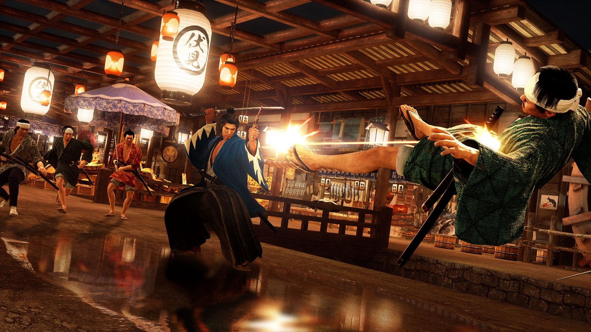
In the remake however, the lighting seems to have been improved by a significant margin without losing the signature aesthetic. Reflections on faraway objects and character models work like they should, which gives a more uniform look all around. Different surfaces seem to have different reflective properties, so certain walls reflect more light than others. There’s also some dynamic lighting in this version, but it seems to have been used in tandem with pre baked lighting for a better visual presentation. We also get to see cinematic lighting for cutscenes in this version, which add extra depth to the models with external rig lights.
Switching gears over to the environment, the original featured a simple layout for levels which goes well with the setting and the time period of the game. It’s not as dense with neon shops and rain soaked streets as the mainline games, and this is certainly a fresh change of pace. The asset quality isn’t anything to gawk at, but it gets the job done without feeling lacking in any particular way. Shadow quality is also on the level that one would expect from a late seventh generation game, which is to say it’s not very impressive either.
As for the remake, the environments feel noticeably better than before thanks to a general uptick in asset quality. The developers have used higher quality textures for environments, or maybe ran the original assets through some upscaling tool – but either way, the results are great. The shadow quality has also seen improvements, and they look a lot crisper than the original version without much artifacts. We should also mention that weather elements like rain and fog look a lot better in the remake thanks to good use of alpha particles and volumetric smoke.
Conclusion
Like A Dragon: Ishin! treads a fine line between being a by the numbers remake and a reimagination of the original, but it ends up being what is inarguably the best way to experience this classic. Most of the changes don’t really tamper with the original vision for the game, so it ends up being a pretty authentic remake that should serve the modern audience pretty well.


