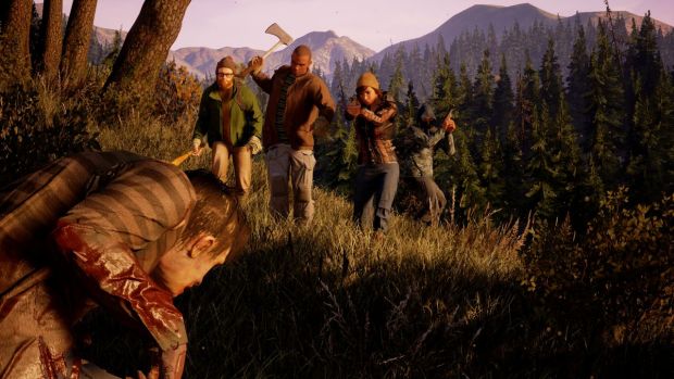
While State of Decay 2 looks like a far more ambitious game than the original title, in all of its showings so far, it has also looked a bit, shall we say, graphically rough around the corners. Which is fine- in the end, no one plays this series because it’s a looker, it has never been about that.
Nonetheless, Undead Labs has been toiling away in the background, and the result is that State of Decay 2 now seems to look far better than it did the last few times we saw it- new screenshots for the game were shared on Twitter (you can see them for yourself below), and they showcase far cleaner, more striking and bold graphics. The game still doesn’t look as eye catching as Rare’s upcoming Sea of Thieves, but it’s definitely come a long way since last E3.
State of Decay 2 is due out on Xbox One and PCs running Windows 10 later this year.
A peaceful scene in any other world – the serenity of snow-capped mountains above the meadows, and the hush of a sacred site. But even here monsters lurk, and the living fight the unrestful dead for survival. It's beautiful, but we can never let down our guard. pic.twitter.com/xdPsmEi1dF
— State Of Decay (@StateOfDecay) February 20, 2018
Smashing through windows is a pretty core feature in SOD, and this window is just begging to be shattered. But beware, there’s no telling how many zeds will be attracted to the sound. – Matt Heiniger, technical artist #Undeadlabs #Microsoftstudios #SOD2 pic.twitter.com/TD8M9nkXm8
— State Of Decay (@StateOfDecay) February 13, 2018

