God of War III is just about half a month from release and just by judging by the recent trailers and amazing screenshots, God of War III has that “Game of the Year” look to it. God of War III has come a long way since it was announced way back in 2008. So how much has Kratos evolved during this period of 12 to 14 months? We at GamingBolt decided to do an HD screenshot comparison of Kratos against himself. We have also assigned points to each of the screen shots indicating the overall quality related to texture details, modeling and attention to details.
Note: Click the images to see them in HD.
December 2008:
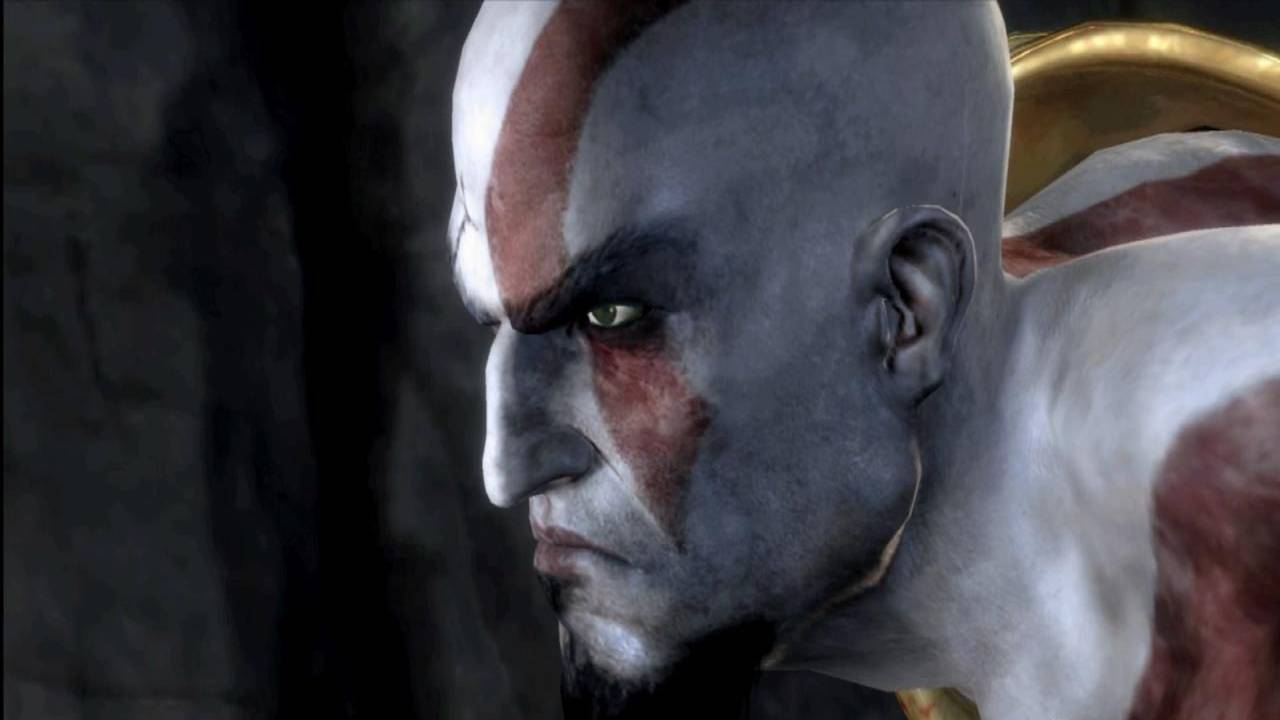
This was one of the first screenshots released for God of War III. Even though the details are immaculate right from day one, it clearly has the rusty look of a game in pre-production. The texture of the skin looks bland and so is the color combination of red and purple does not really shine through. However considering the fact the screen shot is almost 14 months old, it still looks amazing.
GamingBolt rating: 3/5
February 2009:
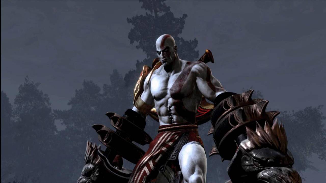
February 2009 shows a number of improvements as compared to the screen shot released in December 2008. The really ‘mean’ of Kratos was clearly visible and so was his overall physical structure coming in shape, with his muscles ripping off from his body. But still the overall skin texture was pretty much bland. So this period saw Kratos getting a more detailed look but the overall texture was still the same.
GamingBolt rating: 3.5/5
June 2009:
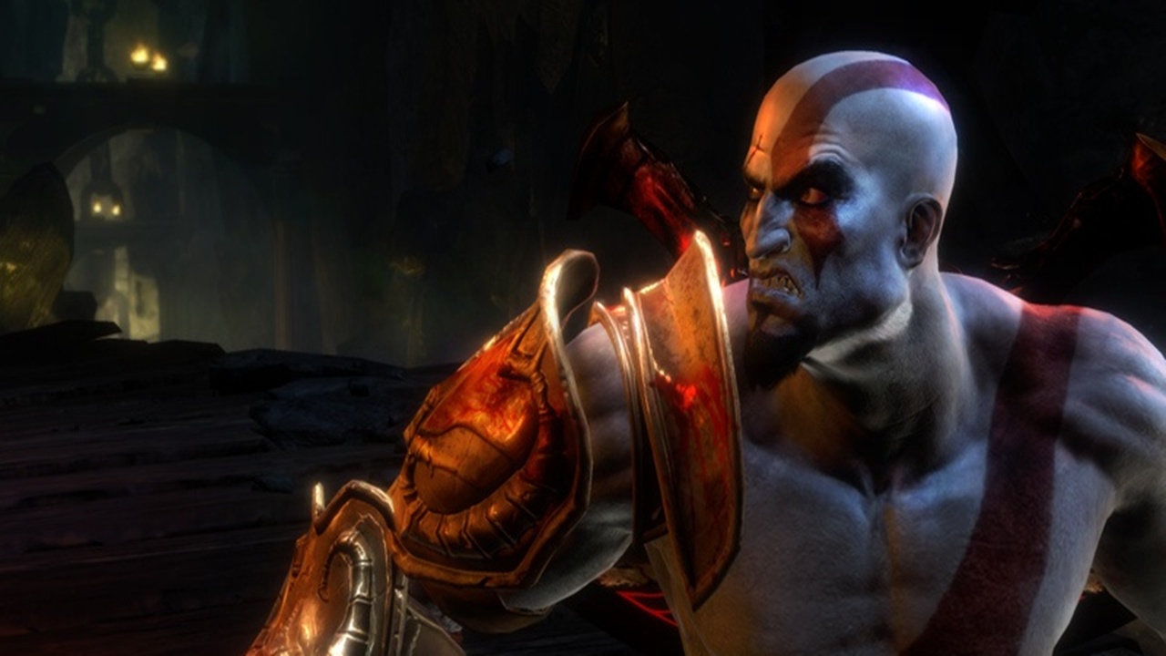
Four to five months of more development effort from Santa Monica studios really paid off. Kratos in this screen shot looks really amazing. The skin texture no longer looked bland and the color combination of Kratos’s body marks and his skin tone just matched perfectly. One thing to be noticed here is Kratos’s armor looks amazingly detailed having a combination of blood stains and that tested ‘n’ rusted look.
GamingBolt rating: 3.8/5
October 2009:
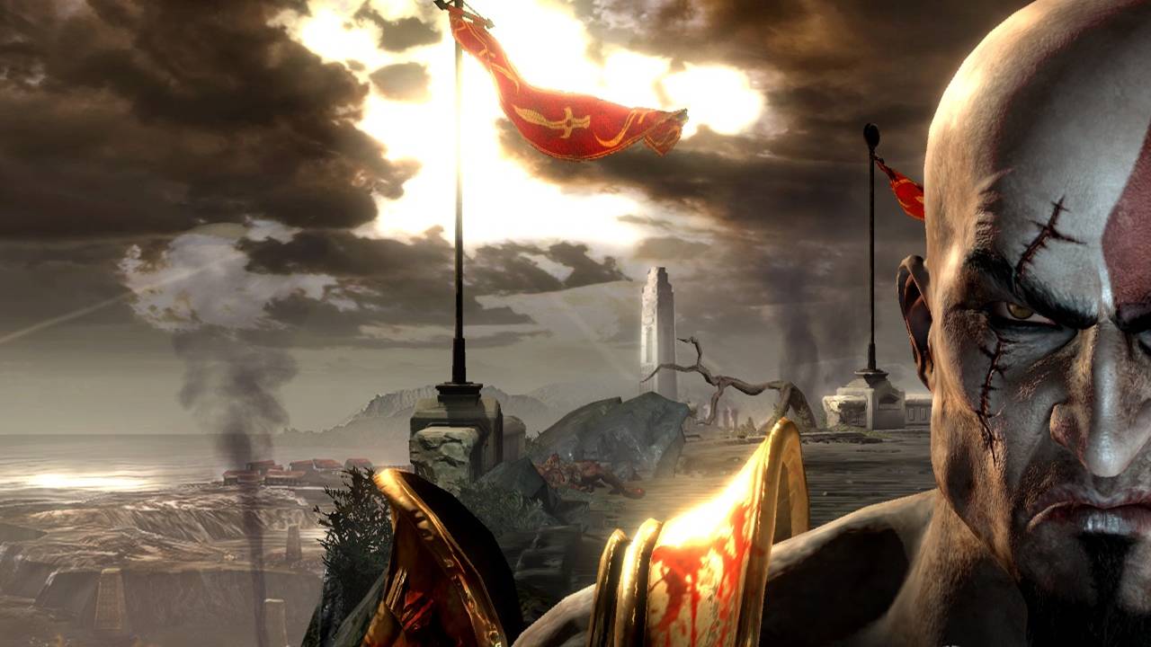
October, last year was an amazing month with some big guns like Uncharted 2: Among Thieves being released. It would have been tough for God of War to give us great graphics, if Uncharted 2 would not have been released, since these days developers constantly compete with each other. But this screenshot really does tell the story. The details in this screen shot are downright amazing, stunning or whatever praise you want to heap on this image. Kratos is angry and is hungry for vengeance and blood shedding and this screen shot sends the shivers in to our hearts. It’s easy to avoid the beautiful background when you have Kratos shining in full glory. Click the image to see it in HD.
GamingBolt rating: 4.2/5
Before Launch:
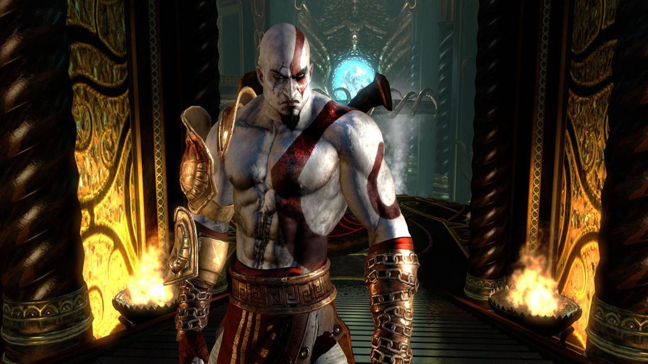
This screen shot gives us a proper view on how Kratos will look in final game, although there is always a possibility that he might actually look much better than this, since retail version are normally better looking than pre-release screen shots. Not a lot of changes as compared to the last screen shot but attention to smaller details like the chain wrapped around his wrists, the veins which are clearly visible in those ‘huge’ biceps and his overall structuring of his armor and clothing go a long way in making Kratos look deadly. This is a stunning example on how a product evolves right from the prototype stage to the Gold version.
GamingBolt rating: 4.8/5
God of War 3 is looking it’s going to be the most amazing game ever to hit the PlayStation 3 and considering how the team at Santa Monica are hard at work in making this game as amazing as they can, we can only say that PlayStation 3 owners are in for a treat this March.

