Unintuitive UI
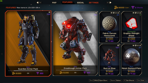
The day one patch did improve some elements of it but the user interface is still pretty unwieldy. We’ll get into problems with the map later but when it comes to basic navigation, there are simply too many menus upon menus for accessing things. Also, why do we have to go to the Forge to change our loadouts? Why can’t we change our inventory in the field? If not on the spot, then at least in a Monster Hunter World-style camp at certain locations. But nope, that would make too much sense.


